Tru Mélange
Tru Mélange is a natural aromatherapy candle brand built around a simple but powerful conviction: that what goes into a candle matters as much as how it smells. Made with 100% non-GMO soy and pure botanical ingredients — free from acetone, benzene, and toluene — the brand needed a digital experience that could communicate both its wellness credentials and its premium aesthetic to a consumer base that is equally values-driven and design-conscious. The project encompassed the full UX/UI design process: industry research, site mapping, wireframing, style guide development, prototyping, usability testing, and iterative refinement.
Tru Mélange
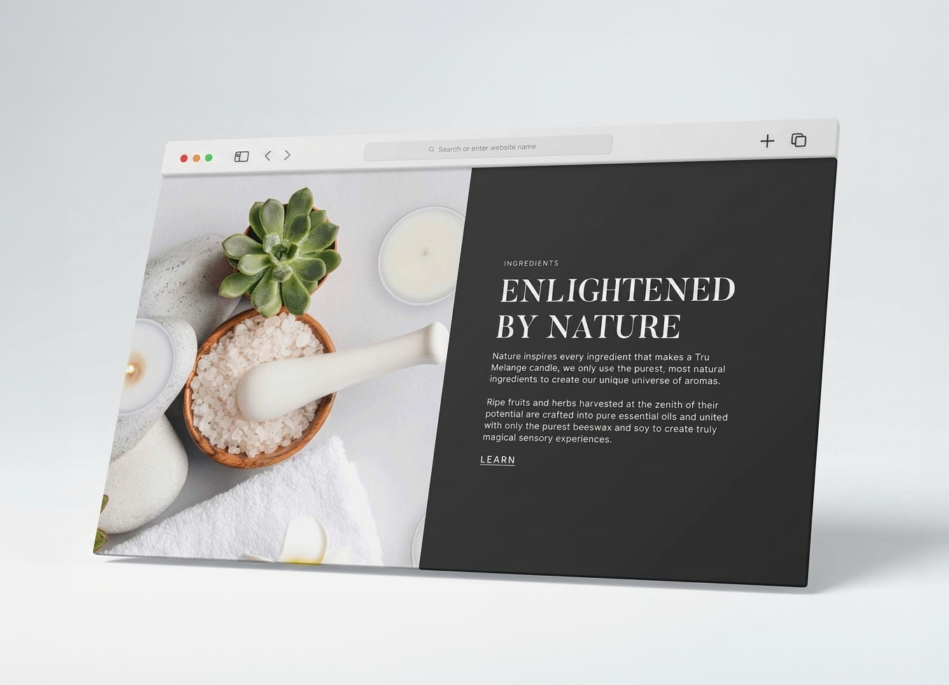
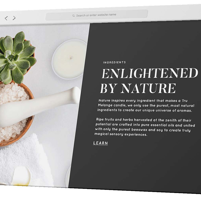
The process began with a thorough industry landscape analysis. Key findings shaped core design decisions throughout: fragrance is the single most important factor in candle purchasing decisions, with three-quarters of buyers rating it as extremely or very important; consumers increasingly purchase candles for aromatherapy and stress reduction as much as home décor; and candles are among the most broadly gifted consumer products across occasions. These insights directly informed the decision to lead the homepage with a fragrance-forward headline — "Don't settle for chemical candles, they just don't make good scents" — that speaks to both the product's sensory promise and its clean ingredient positioning. Competitor research further identified gaps in how natural candle brands were presenting their certifications and ingredient transparency online, areas where Tru Mélange could meaningfully differentiate.
Tru Mélange
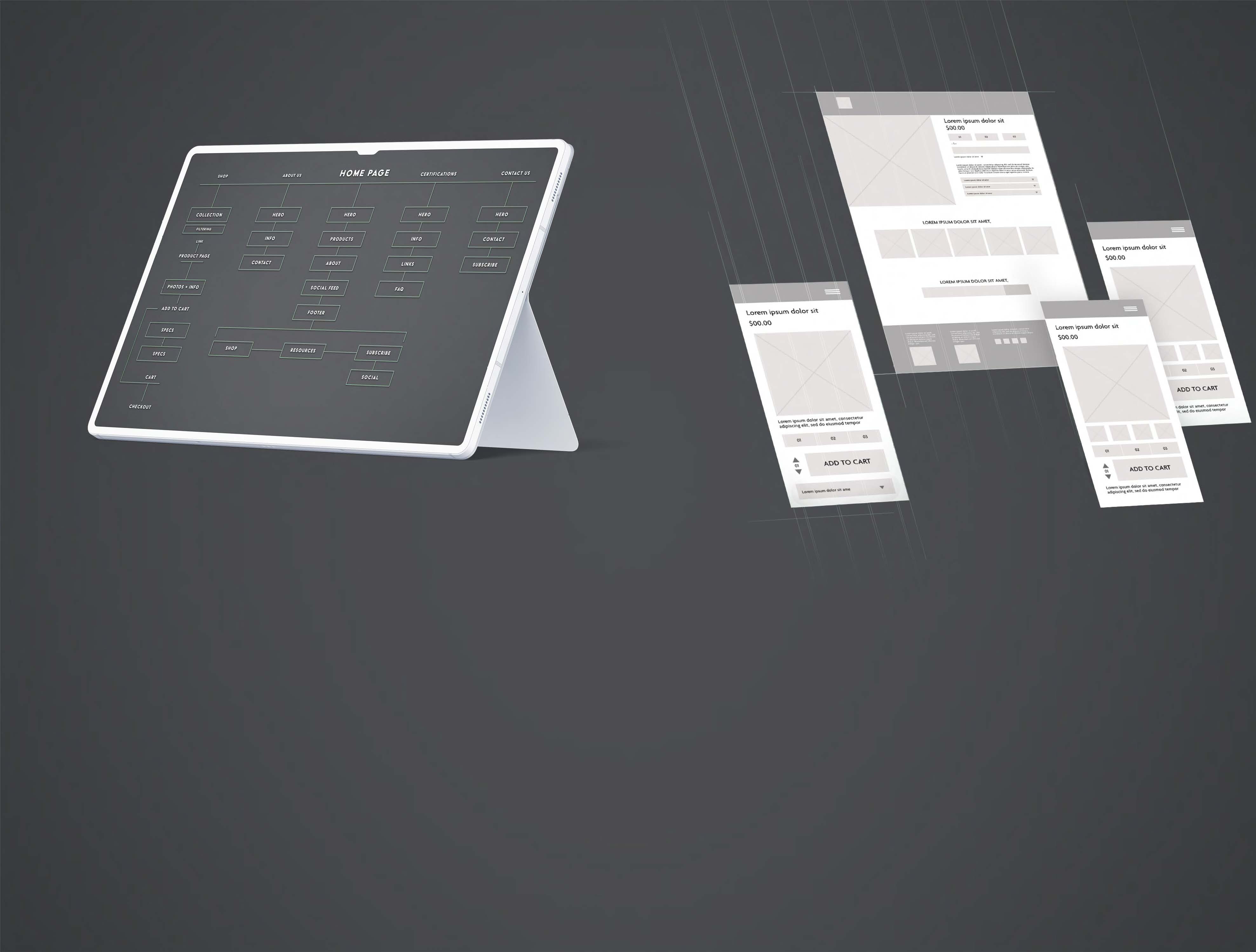
One of the earliest and most consequential design challenges was mapping a logical, frictionless purchase path. The site map was structured around five primary destinations — Shop, About Us, Certifications, Contact Us, and Home — with the Shop path receiving the most detailed attention, tracing a clear flow from collection browsing through product page to cart and checkout. A dedicated Certifications page was a deliberate strategic choice, surfacing the brand's organic and non-GMO credentials as a standalone trust signal rather than burying them in product descriptions. This addressed a key tension in the natural wellness space: consumers want proof, not just claims.
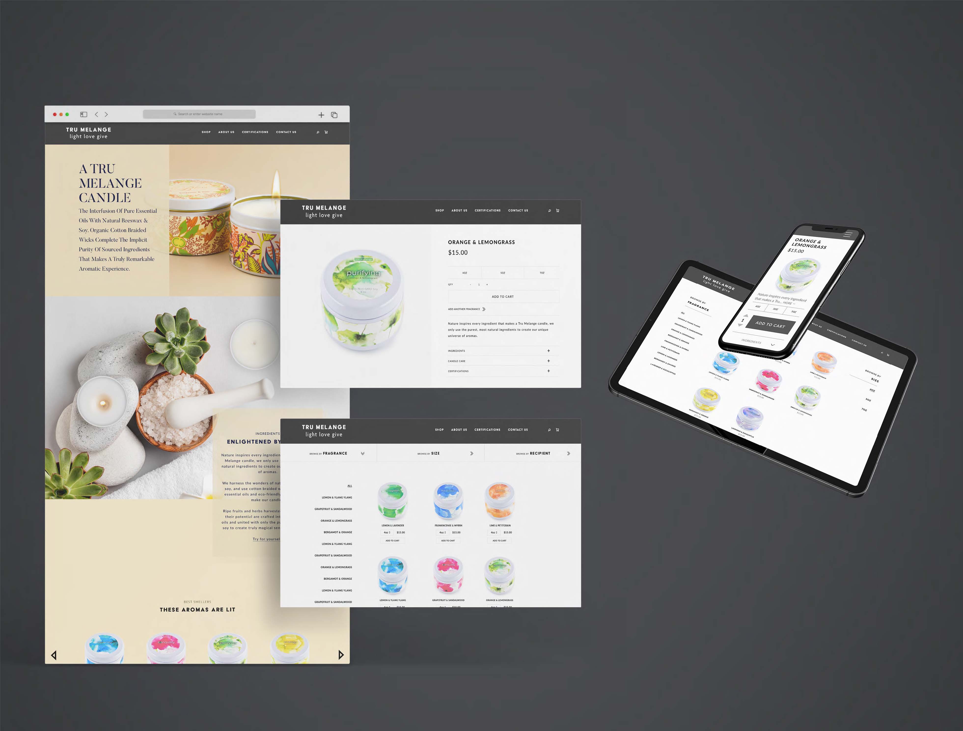
The collection page presented a specific UX challenge: with multiple fragrance variants and three size options per candle, the risk of overwhelming or confusing a buyer was real. The solution was a dual-filter system allowing users to browse by Fragrance or by Size — giving shoppers two intuitive entry points depending on whether they're led by scent preference or practical need. On mobile, this collapses into a clean dropdown format that keeps the browsing experience uncluttered.
Tru Mélange
Wireframes were developed across desktop and mobile breakpoints simultaneously, ensuring responsive behavior was designed into the architecture from the start rather than retrofitted. The product page wire established the core layout that carried through to final design: large product image on the left, size selectors and add-to-cart on the right, with expandable accordions below for Ingredients, Candle Care, and Certifications. This structure keeps the purchase action front and center while making supplementary information accessible without cluttering the primary decision-making space. An "Add Another Fragrance" prompt was incorporated as a lightweight upsell mechanism, encouraging multi-unit purchases without disrupting the main conversion flow.
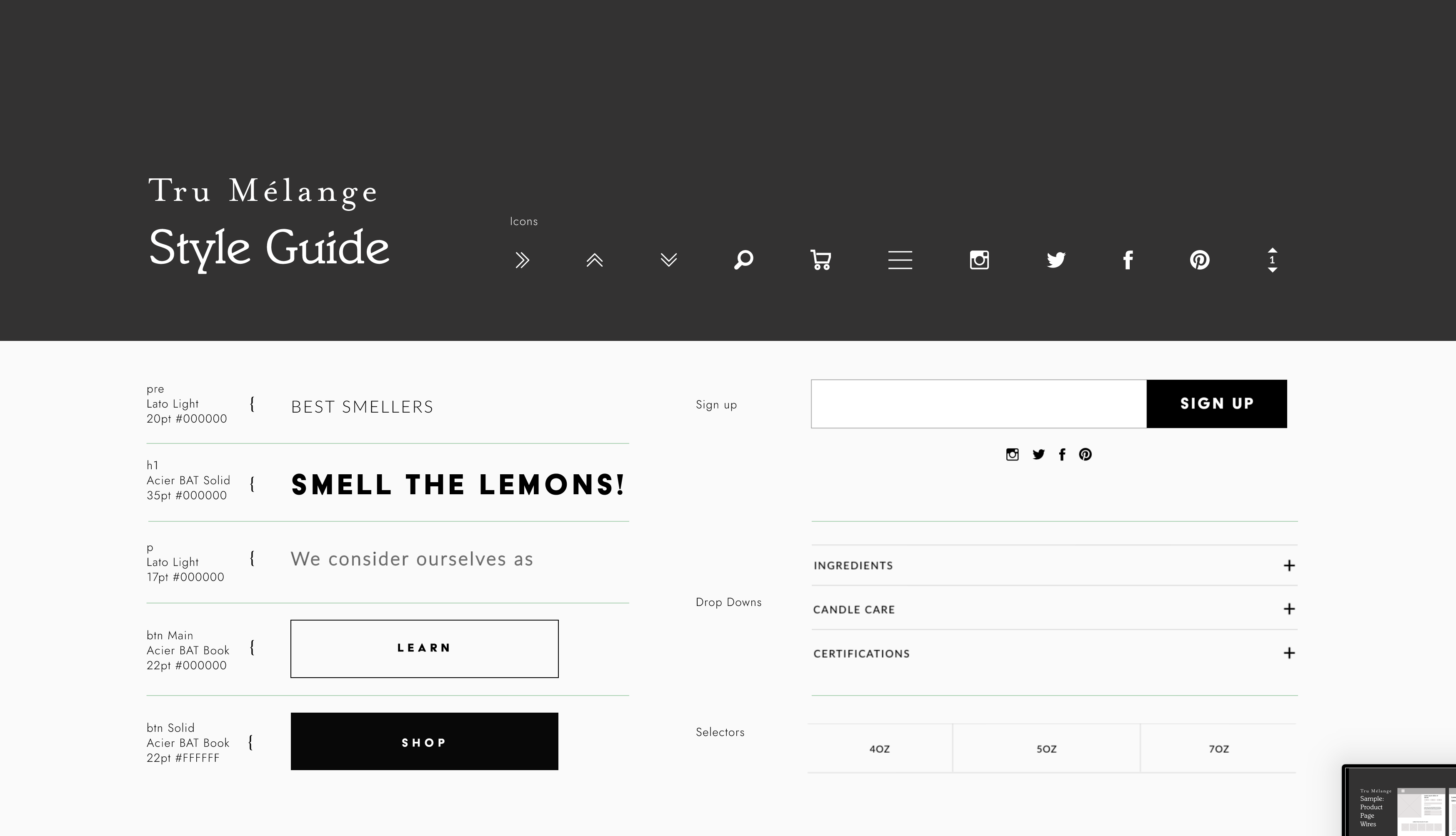
Tru Mélange
The style guide was developed to balance the brand's dual identity: artisan and natural on one hand, clean and modern on the other. The typographic system pairs Acier BAT — a bold, condensed display face used for headlines and CTAs — with Lato Light for body text, creating contrast between assertive brand voice and approachable product communication. The palette is intentionally restrained: a near-black charcoal for the header and UI elements, white space as the dominant canvas, and the watercolor-painted candle labels themselves providing the colour and warmth throughout. This decision was deliberate — letting the product photography and packaging carry the visual personality while the UI stays neutral and premium.
Icon design was given careful attention, with a custom set developed for navigation, cart, search, and social — small details that contribute significantly to the overall refinement of the experience.
Tru Mélange
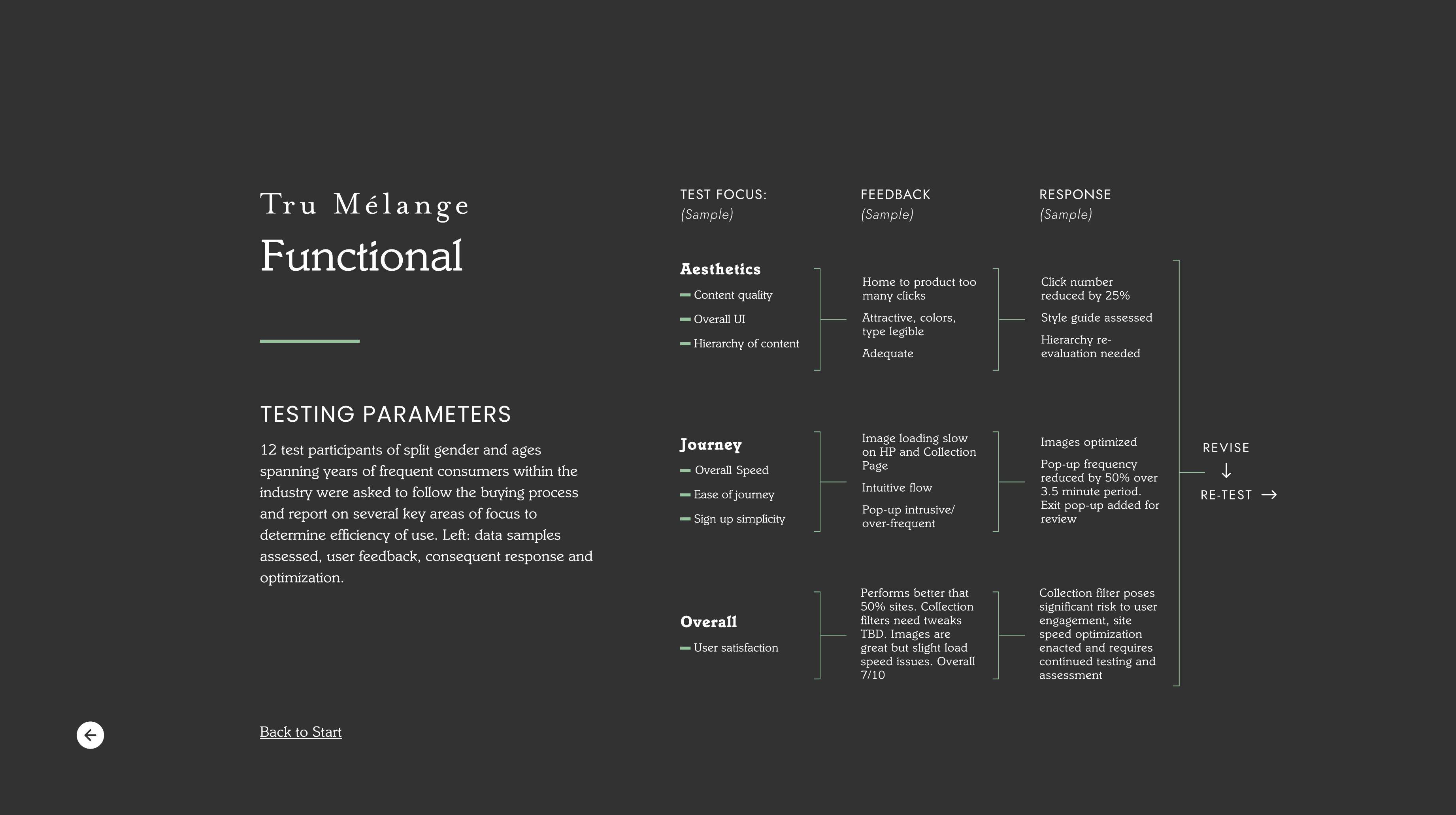
Testing was conducted with 12 participants of split gender spanning a range of ages, all frequent consumers within the candle and wellness category. They were asked to complete the buying process and report on three focus areas: aesthetics, journey, and overall satisfaction.The feedback surfaced three significant issues. First, the path from homepage to product was requiring too many clicks, creating drop-off risk early in the journey — click count was subsequently reduced by 25% through navigation restructuring and more direct homepage CTAs. Second, image loading on the homepage and collection page was slow, a critical problem for a brand whose product appeal is almost entirely visual — images were optimized and load performance improved. Third, a newsletter pop-up was appearing too frequently and too early, identified as intrusive by the majority of participants — pop-up frequency was reduced by 50% over a 3.5-minute window, and an exit-intent version was added as a less disruptive alternative.
The collection filter system was flagged as posing a significant risk to user engagement and was earmarked for continued testing and refinement. Overall user satisfaction scored 7/10 across participants, with the site noted as performing better than 50% of comparable sites tested — a strong baseline from which to continue iterating.
Tru Mélange
The Tru Mélange project demonstrates what a rigorous, research-led design process looks like in practice for a small eCommerce brand. Every decision — from the ingredient-forward homepage copy to the dual-filter collection architecture to the accordion product page layout — was grounded in either industry data, user behavior insight, or direct testing feedback. The result is a site that earns trust, communicates quality, and moves customers toward purchase with minimal friction.
A collection of work spanning UX, branding, and digital design across luxury eCommerce, wellness, foodservice, and national consumer brands. Every project starts with a question: what does this brand need to say, and what's the clearest, most compelling way to say it? The answer is never the same twice, but the approach always is: understand the audience, respect the user, and make every design decision earn its place.
TAAKT Watches
Branding | Print

Shuteye Home
Branding | Web/UX/UI
Menuology
Web/UX/UI
Tru Melange
Web/UX/UI
SÕL Organics
Branding | Print | Digital
Print Design
Branding | Print
Packaging Design
Packaging | Print
.jpg)
PepsiCo
Digital
Soosh
Web/UX/UI
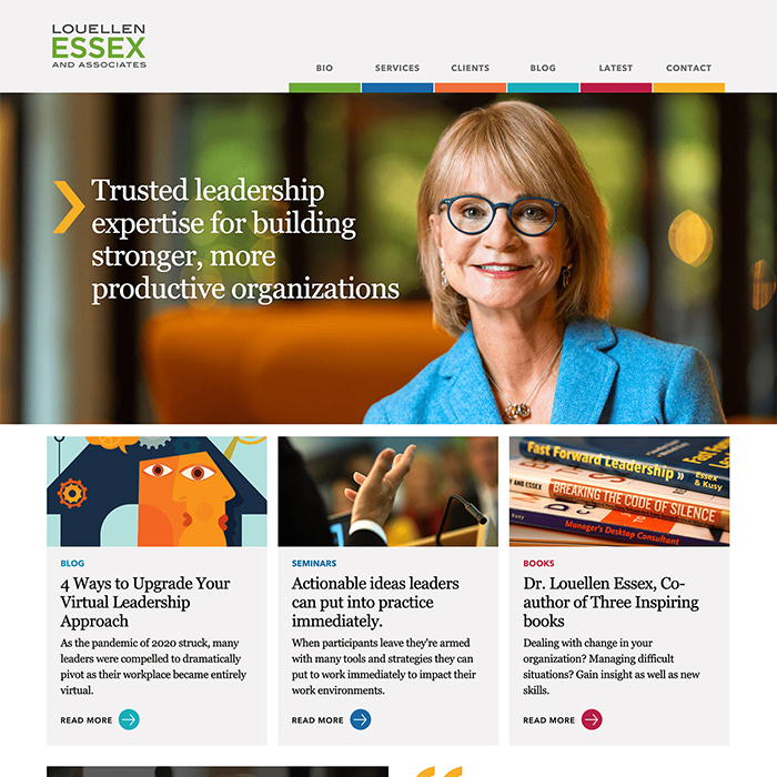
Louellen Essex
Web/UX/UI
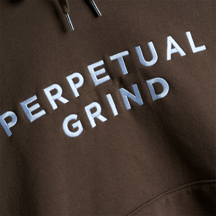
Perpetual Grind
Print | Apparel
Logo
Branding | Logo