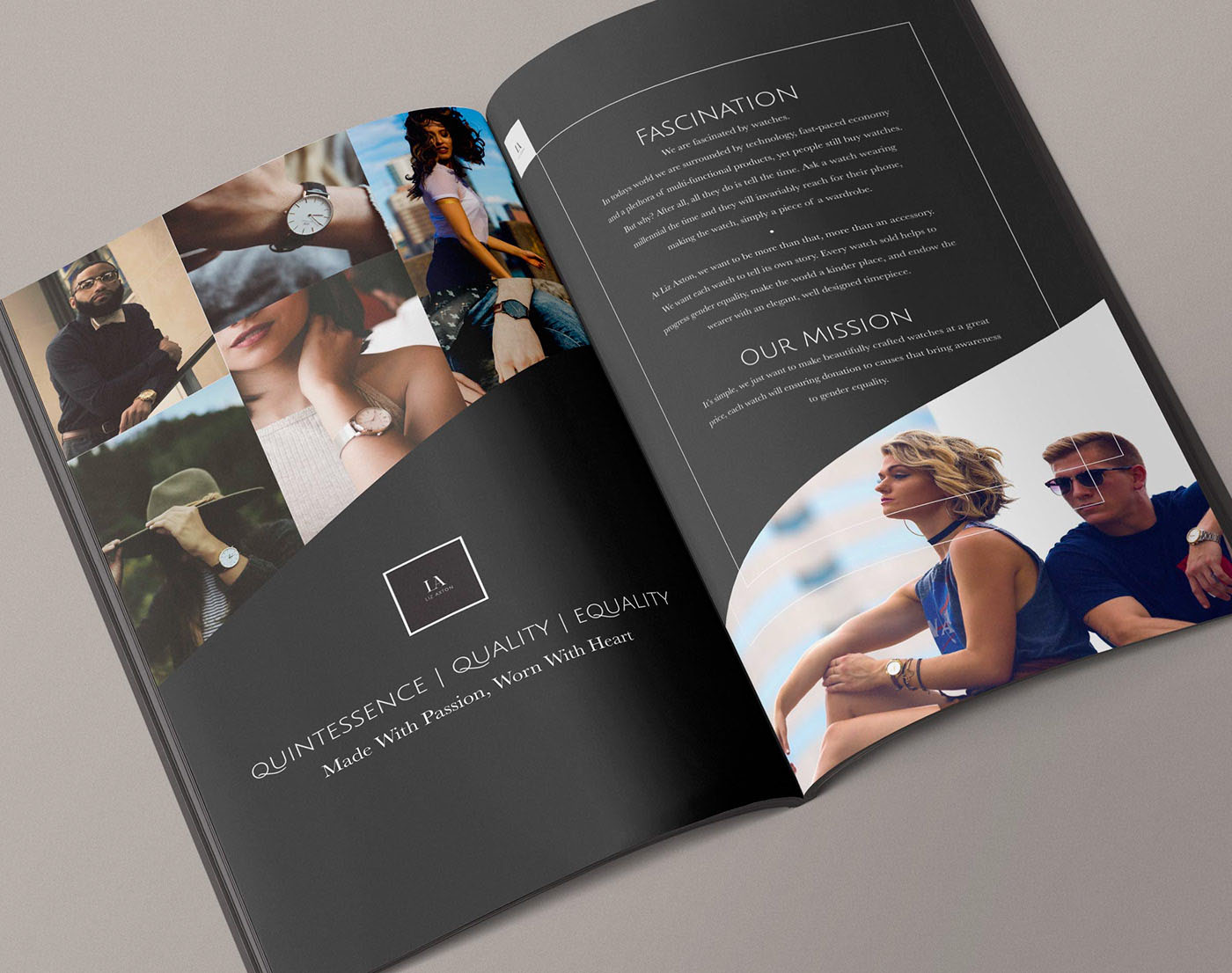
Liz Axton
The central challenge in designing the Liz Axton brand lookbook was communicating that this was not simply a watch company, but a values-driven brand rooted in gender equality. The risk of feeling either overly corporate or overly political was real. To thread that needle, I anchored the design system in restraint and elegance — a near-black palette with high-contrast white typography — so the brand could carry its message with authority rather than noise. The editorial spread structure, with a photo mosaic on the left and editorial copy on the right, was a deliberate compositional choice: it mirrored the brand's own duality of beauty and purpose. The image selection process required careful curation to reflect inclusivity without feeling like a checklist, leading me to choose candid, lifestyle-forward photography that let the watches speak through real moments of wear.
On the typography side, I worked through several iterations to find the right hierarchy between the bold display headlines ("FASCINATION," "OUR MISSION") and the delicate body copy beneath them. Keeping the body text light and slightly condensed against the dark background created breathing room that felt luxurious — a critical signal for a premium product. The tagline treatment, "QUINTESSENCE | QUALITY | EQUALITY," demanded a typeface and sizing that could hold weight as a brand manifesto without overwhelming the layout. I chose a wide-tracked, uppercase serif treatment to give it monument-like presence on the left page. The logo lockup in its bordered square frame was refined to feel architectural — a small but considered decision that reinforced the brand's positioning as precise, intentional, and enduring.
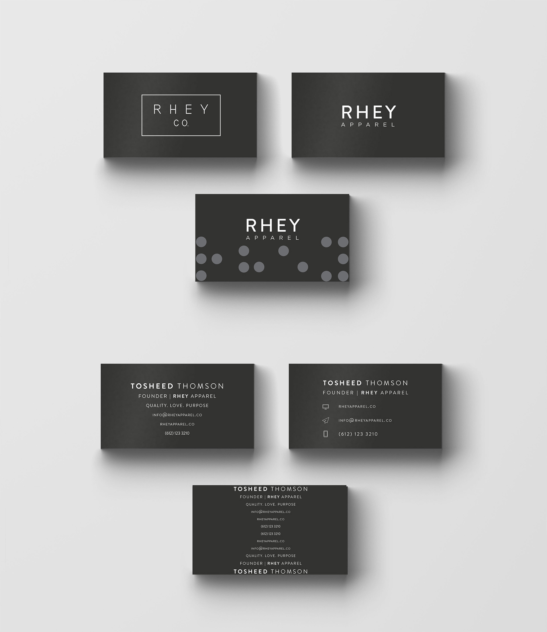
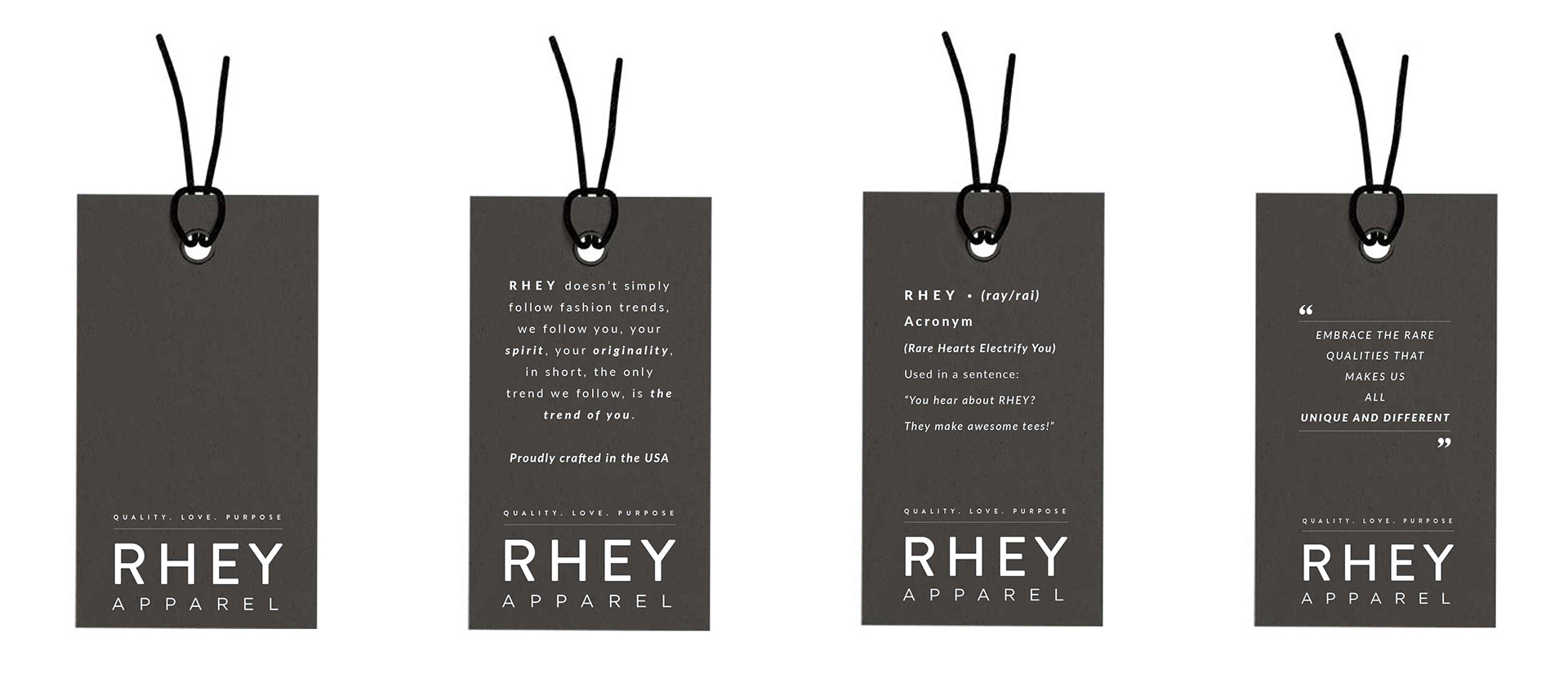
RHEY Apparel
The core design challenge for RHEY Apparel was translating a deeply personal brand philosophy — Rare Hearts Electrify You — into a cohesive visual identity that could live across touchpoints as varied as business cards, hang tags, and brand manifestos. The brand's DNA centered on individuality and diversity, which meant the design system needed to feel curated and intentional without being rigid or cold. I established a monochromatic near-black palette with crisp white typography as the foundation, creating a visual language that felt premium and editorial without overshadowing the brand's warm, people-first message. The wide-tracked, spaced letterforms in the wordmark gave RHEY a quiet confidence — bold enough to command attention on a hang tag, refined enough to anchor a brand statement page.
With the foundation set, the real problem-solving came in scaling the system across print collateral without losing consistency or personality. The hang tag series presented a specific challenge: each tag needed to carry a different piece of brand messaging while still reading as a unified family. I solved this by locking the RHEY Apparel logotype and tagline to the bottom of every tag, creating a fixed anchor that made each variation feel like part of a series rather than a standalone piece. The business card iterations followed a similar logic — exploring layout and information hierarchy across multiple versions while maintaining strict typographic discipline. Tight letter-spacing, restrained use of scale contrast between the founder name and title, and the consistent dot-pattern texture variant gave the cards range without chaos. Every decision across the system came back to one question: does this feel like RHEY?
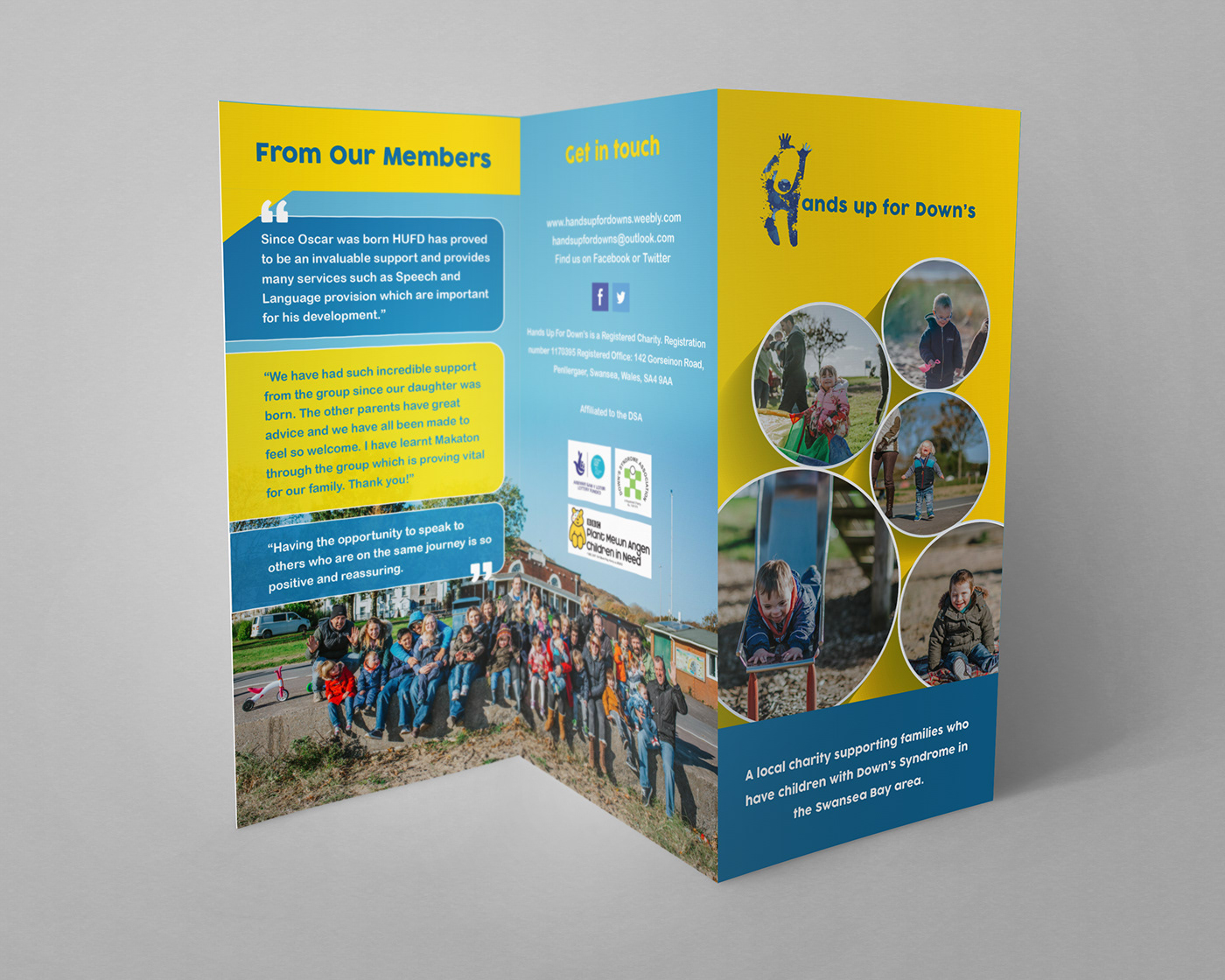
Hands Up For Down's
Designing for a charity like Hands Up for Down's required balancing two things that can easily pull against each other: the energy and joy of the community it serves, and the credibility it needed to earn trust from new families and potential donors. The existing brand colors — sunshine yellow, sky blue, and deep navy — were a natural starting point, but the challenge was deploying them in a way that felt celebratory rather than juvenile. I used bold color-blocked panels as structural anchors throughout the trifold, letting photography do the emotional heavy lifting within those fields. The circular photo crops on the cover panel were a deliberate design decision — softening the layout and echoing the inclusive, community-oriented spirit of the organization. Pairing a playful handwritten script for section headers against clean sans-serif body copy created a voice hierarchy that felt both approachable and professionally organized.
The interior presented a different set of problems: fitting meaningful content — member testimonials, a mission statement, fundraising information, and contact details — across six panels without the layout feeling crowded or overwhelming to a reader who may be navigating a difficult life moment. I solved this through disciplined use of white space within the color blocks, angled geometric dividers between panels to create visual momentum, and a consistent pull-quote treatment that gave member voices their own distinct visual register. The testimonial bubbles on the back panel were particularly important — they needed to feel warm and personal, not like a marketing device, so I kept them conversational in shape and let the real words from real families speak without heavy graphic intervention. Every layout decision came back to the same brief: make a family picking this up for the first time feel like they've already found their people.
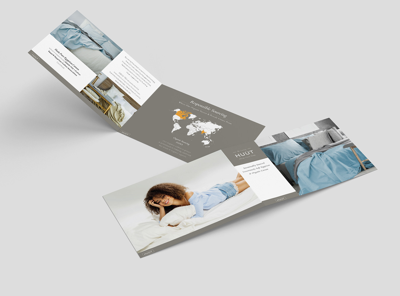
HUUT Bedding
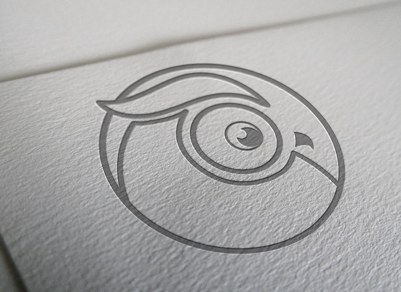
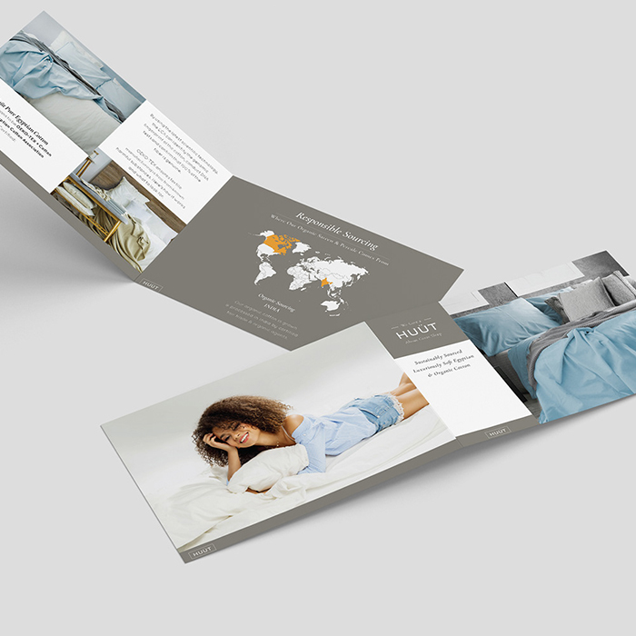
The central design challenge for HUUT was communicating luxury and ethical responsibility simultaneously — two brand values that don't always speak the same visual language. Premium bedding brands tend toward cool minimalism, while sustainability-focused brands often lean into earthy, grassroots aesthetics. The solution was finding the intersection: a warm greige palette that felt genuinely sophisticated rather than clinical, paired with restrained serif and script typography that signaled craftsmanship without pretension. The logo was the most critical problem to solve first. I developed an owl mark — a nod to wisdom and considered living — rendered as a single continuous line drawing that could be debossed, foil-stamped, or printed at any scale without losing integrity. Seeing it pressed into textured paper stock confirmed the mark worked exactly as intended: it felt like it belonged on something worth keeping.
With the logo as the north star, the collateral system followed naturally. The trifold brochure needed to carry substantial sourcing information — including a responsible sourcing map tracking organic cotton from certified fair-trade agents in India — without ever feeling like a technical document. I solved this by treating the map as a design element in its own right, using amber as a single accent color against the neutral field to draw the eye to origin points on the globe. This amber reappeared selectively throughout the system, doing quiet work as a signal of transparency and provenance. The landscape brochure format was a deliberate choice over the standard portrait — it echoed the horizontal expanse of a made bed, reinforcing the product experience before a single sheet was unfolded. Every touchpoint, from the debossed logo on the cover to the lifestyle photography panels inside, was designed to make a customer feel that the care taken in the design was the same care taken in the cotton.VvisualizeVvisualize show_widget
A collection of work spanning UX, branding, and digital design across luxury eCommerce, wellness, foodservice, and national consumer brands. Every project starts with a question: what does this brand need to say, and what's the clearest, most compelling way to say it? The answer is never the same twice, but the approach always is: understand the audience, respect the user, and make every design decision earn its place.
TAAKT Watches
Branding | Print

Shuteye Home
Branding | Web/UX/UI
Menuology
Web/UX/UI
Tru Melange
Web/UX/UI
SÕL Organics
Branding | Print | Digital
Print Design
Branding | Print
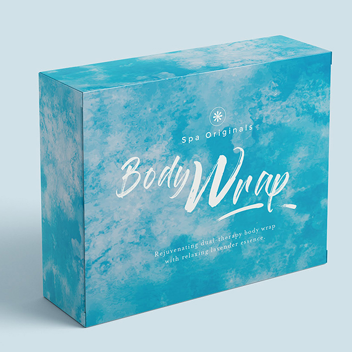
Packaging Design
Packaging | Print
.jpg)
PepsiCo
Digital
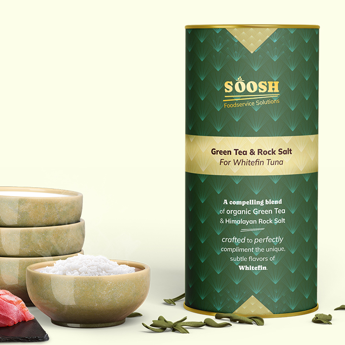
Soosh
Web/UX/UI
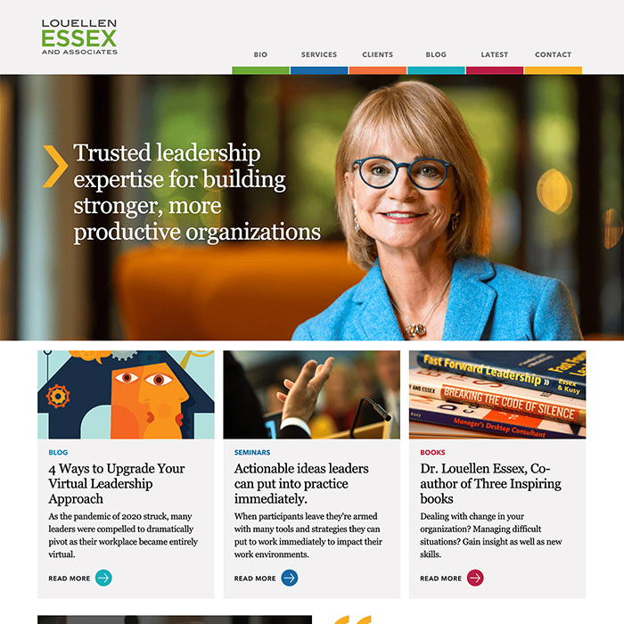
Louellen Essex
Web/UX/UI
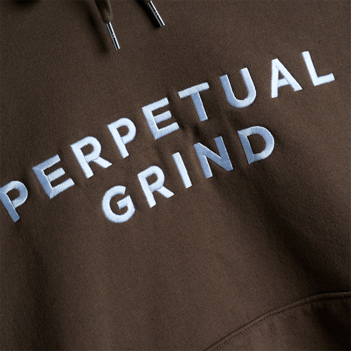
Perpetual Grind
Print | Apparel
Logo
Branding | Logo
Get Started Today
Lorem ipsum dolor sit amet, consectetur adipiscing elit. Donec nunc risus, consectetur eu sodales elementum, convallis in neque. Phasellus a felis ut erat hendrerit accumsan.