TAAKT Watches
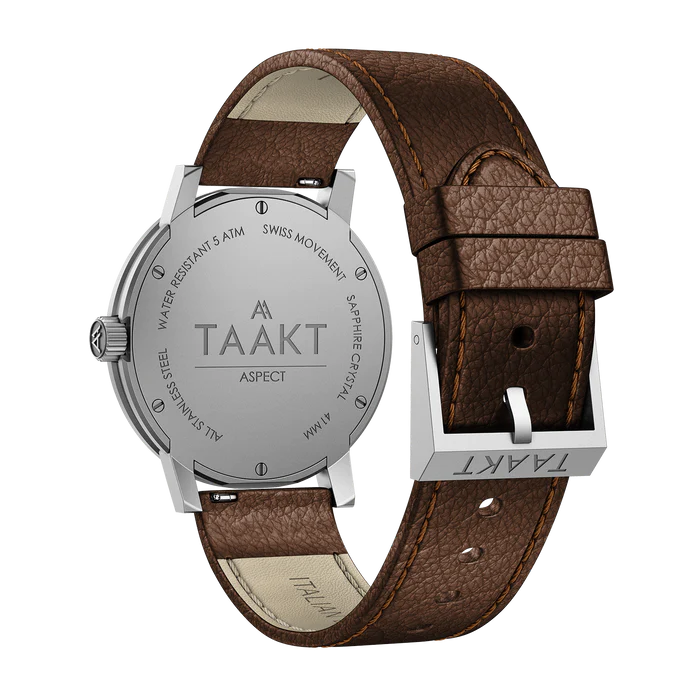
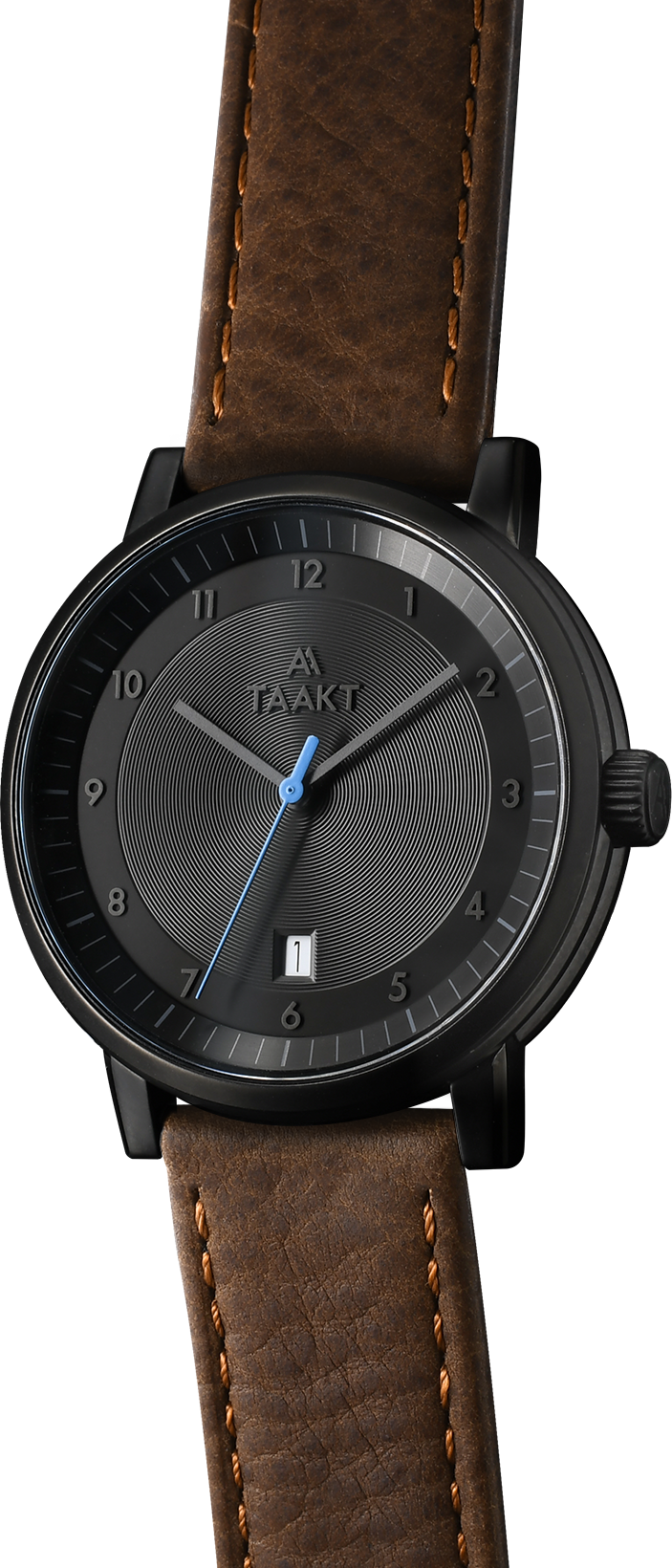
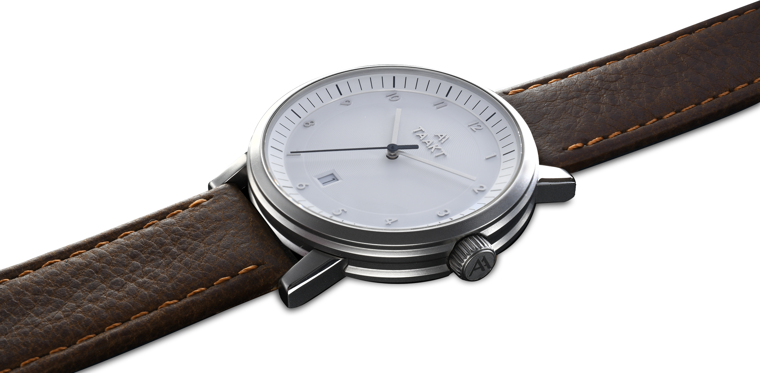
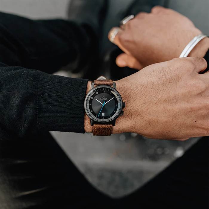
TAAKT Watches is a lifestyle brand built around a truly refined product—a Swiss-made timepiece crafted with precision, durability, and understated elegance. Featuring an anti-reflective sapphire crystal face and meticulously engineered components, the product itself embodies a commitment to quality, craftsmanship, and timeless design. From the outset, the objective was to create a brand identity that would not only complement the physical product but elevate it—positioning TAAKT as a modern yet enduring presence within the competitive watch market.
The designer’s passion for horology and attention to detail were evident throughout the process, influencing every aspect of the visual direction. This deep appreciation for both form and function informed a branding approach rooted in clarity, restraint, and precision—ensuring that the identity would feel as considered and intentional as the watch itself. The challenge was to translate these qualities into a cohesive visual system that communicates both the heritage of Swiss craftsmanship and the contemporary appeal of a lifestyle-driven brand.
TAAKT Watches
The logotype was carefully developed around the distinctive name “TAAKT,” drawing inspiration from the sharp, geometric forms of the Swiss Alps. The letterforms were refined to achieve a balance between modern minimalism and classic structure—resulting in a mark that feels both confident and timeless. Subtle detailing within the typography reinforces a sense of precision and quality, while maintaining versatility across a range of applications.
Beyond the logo, the broader brand system was designed to ensure consistency and flexibility across all touchpoints. A restrained color palette, clean typographic hierarchy, and deliberate use of spacing work together to create a premium, uncluttered aesthetic that allows the product to remain the focal point. Every element was considered with scalability in mind, enabling seamless application across digital platforms, print materials, and packaging.
TAAKT Watches
Services delivered as part of this project included the development of a comprehensive logo suite with full file type variations, color and monochrome adaptations, and clear usage guidelines to support long-term brand consistency. A detailed brand style guide was created to define visual standards and best practices, ensuring alignment across future executions. In addition, a complete typographic system was established for use across both print and web applications, supporting a cohesive and recognizable brand presence.
The result is a refined and versatile brand identity that reflects the core values of TAAKT Watches—precision, quality, and timeless design—while providing a strong foundation for growth across multiple channels and markets.
A collection of work spanning UX, branding, and digital design across luxury eCommerce, wellness, foodservice, and national consumer brands. Every project starts with a question: what does this brand need to say, and what's the clearest, most compelling way to say it? The answer is never the same twice, but the approach always is: understand the audience, respect the user, and make every design decision earn its place.
TAAKT Watches
Branding | Print

Shuteye Home
Branding | Web/UX/UI

Menuology
Web/UX/UI
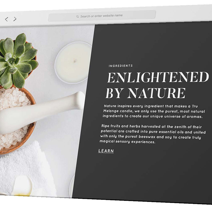
Tru Melange
Web/UX/UI
SÕL Organics
Branding | Print | Digital

Print Design
Branding | Print

Packaging Design
Packaging | Print
.jpg)
PepsiCo
Digital
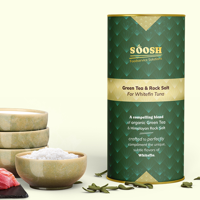
Soosh
Web/UX/UI

Louellen Essex
Web/UX/UI

Perpetual Grind
Print | Apparel

Logo
Branding | Logo