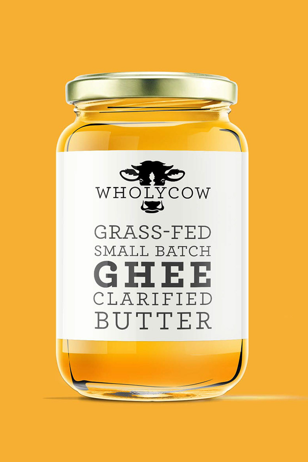
Wholy Cow
Wholycow is a small-batch, grass-fed ghee brand that needed packaging bold enough to stand out on a specialty grocery shelf while staying true to a playful, farm-honest brand personality. The design solution centers on a confident black-and-white illustrated cow that wraps around the label, rendered in a chunky, graphic style that feels simultaneously retro and contemporary. The illustration does double duty — it immediately communicates the product's grass-fed, farm-sourced origins while injecting personality and shelf presence that purely typographic competitors simply can't match. The brand name "Wholycow" arcs vertically along the left edge in bold curved lettering, referencing vintage signage and giving the label a tactile, hand-crafted quality that reinforces the small-batch positioning.
The product descriptors — Grass-Fed, Small Batch, Ghee, Clarified Butter — are set in a stacked, heavy typeface that sits directly on the cow's body, creating a visual pun that ties illustration and copy together in a single cohesive moment. Against a vibrant golden-yellow background that mirrors the warm amber of the ghee itself, the stark black-and-white label pops with high contrast and immediacy.
The result is packaging that feels artisan without being precious, fun without being frivolous — a brand that takes its product seriously but doesn't take itself too seriously.
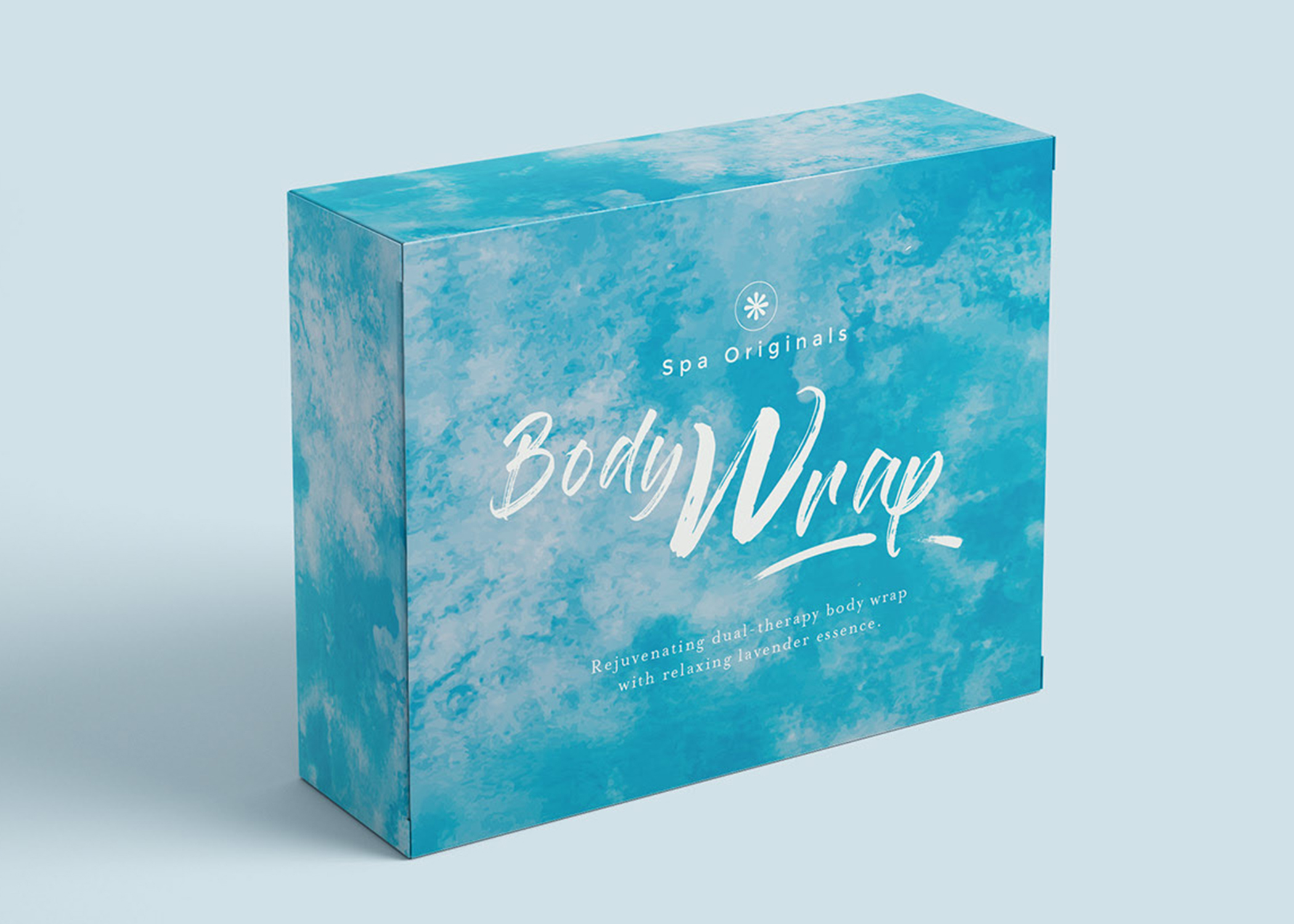

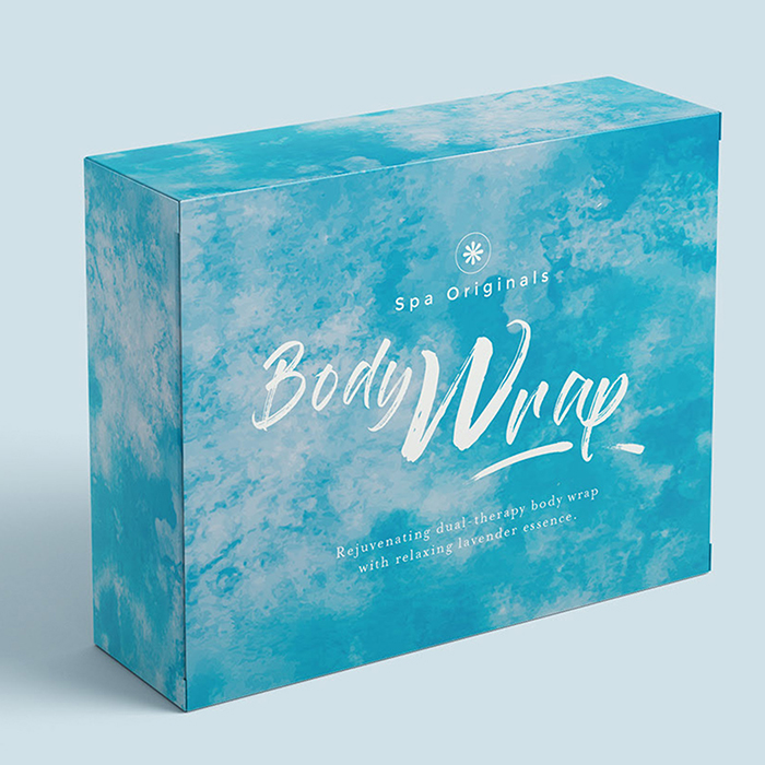
Spa Originals
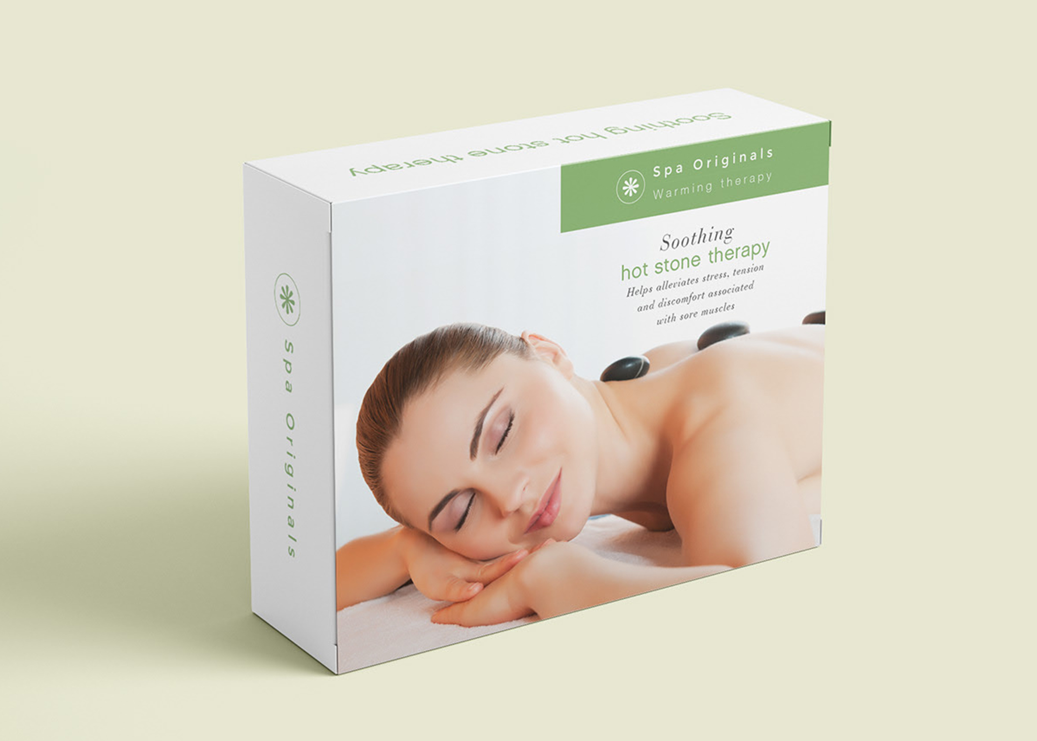
The Spa Originals packaging system was designed to solve a common challenge in the wellness category: balancing clinical product information with an emotional, spa-like appeal. Existing products in this space often lean too heavily in one direction—either overly sterile or visually cluttered—making it difficult for consumers to quickly understand benefits while feeling drawn to the experience. The solution was a flexible design framework that pairs calming, sensory-driven visuals with a clear and structured information hierarchy. Soft gradients, botanical imagery, and tranquil photography establish an immediate sense of relaxation, while carefully organized panels guide the user through key benefits, ingredients, and usage without overwhelming the layout.
A second challenge was creating consistency across a growing product line without sacrificing individuality. This was addressed through a modular system that uses color, imagery, and subtle pattern shifts to differentiate each product while maintaining a unified brand presence. Typography and layout remain consistent across all SKUs, ensuring familiarity and ease of navigation both on shelf and online. By refining the balance between storytelling and utility, the final design transforms each package into both an informative tool and an extension of the spa experience—positioning Spa Originals as a brand that is not only effective, but thoughtfully designed for moments of calm and care.
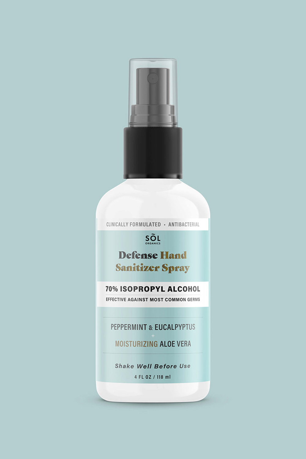
Defense Hand Sanitizer
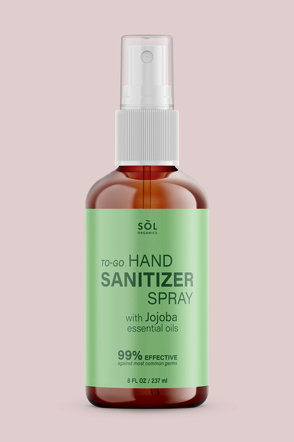
When the COVID-19 pandemic brought consumer spending on non-essential goods to a near standstill, SÕL Organics — an organic, fair-trade cotton bedding eCommerce brand — faced an existential challenge. With mattress and bedding sales in freefall, the business needed to find a way to stay operational, generate revenue, and remain relevant to customers whose priorities had shifted overnight. The solution was a strategic pivot: leveraging the brand's existing relationships with organic cotton suppliers and its established eCommerce infrastructure to launch an entirely new product line centered on personal protection.
The result was the Defense Hand Sanitizer Spray and the Defense PPE Safety Kit — products that had to be developed, designed, and brought to market rapidly, without compromising the brand integrity SÕL Organics had built. The hand sanitizer itself was formulated with 70% isopropyl alcohol for clinical effectiveness, while ingredients like peppermint, eucalyptus, and moisturizing aloe vera kept it aligned with the brand's organic, wellness-forward identity. The PPE Safety Kit bundled the sanitizer spray with two GOTS-certified organic cotton face masks — a natural fit given the company's existing expertise in organic cotton sourcing and manufacturing.
A key part of the challenge was ensuring the new products looked and felt like a natural extension of the SÕL Organics brand rather than an opportunistic cash grab. Every design decision — from the soft teal and natural kraft packaging to the clean label typography and ingredient-forward messaging — was made to preserve the premium, trustworthy aesthetic customers already associated with the brand. Product photography was treated with the same care as the core bedding line, using botanical props and clean white backgrounds to reinforce the organic credentials of the formulation. The packaging clearly communicated both efficacy and values: clinical protection on one hand, organic and sustainable materials on the other.
The pivot ultimately allowed SÕL Organics to maintain operations through one of the most disruptive periods in recent retail history, while demonstrating that a brand built on trust, quality materials, and thoughtful design could adapt without losing its identity.


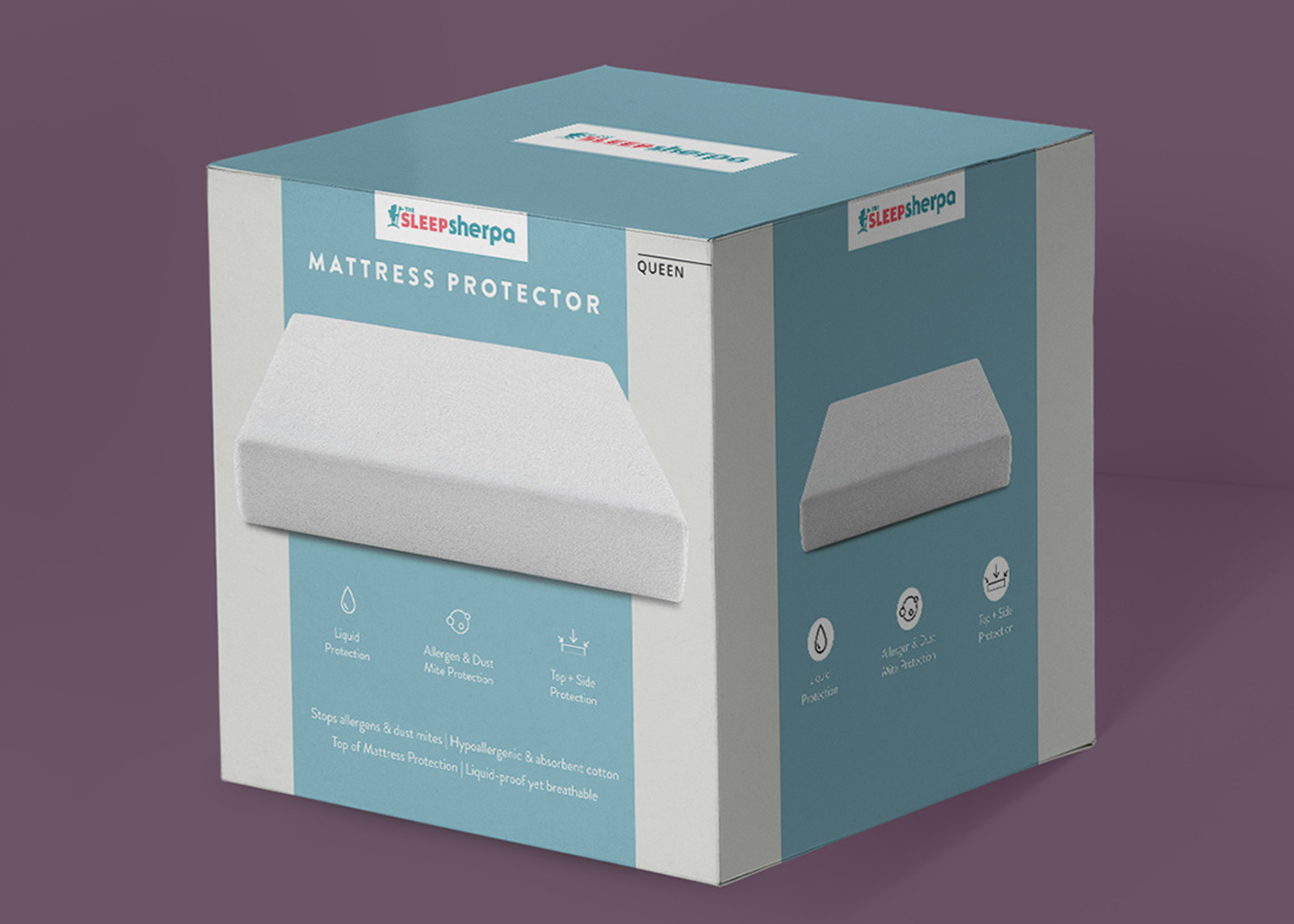
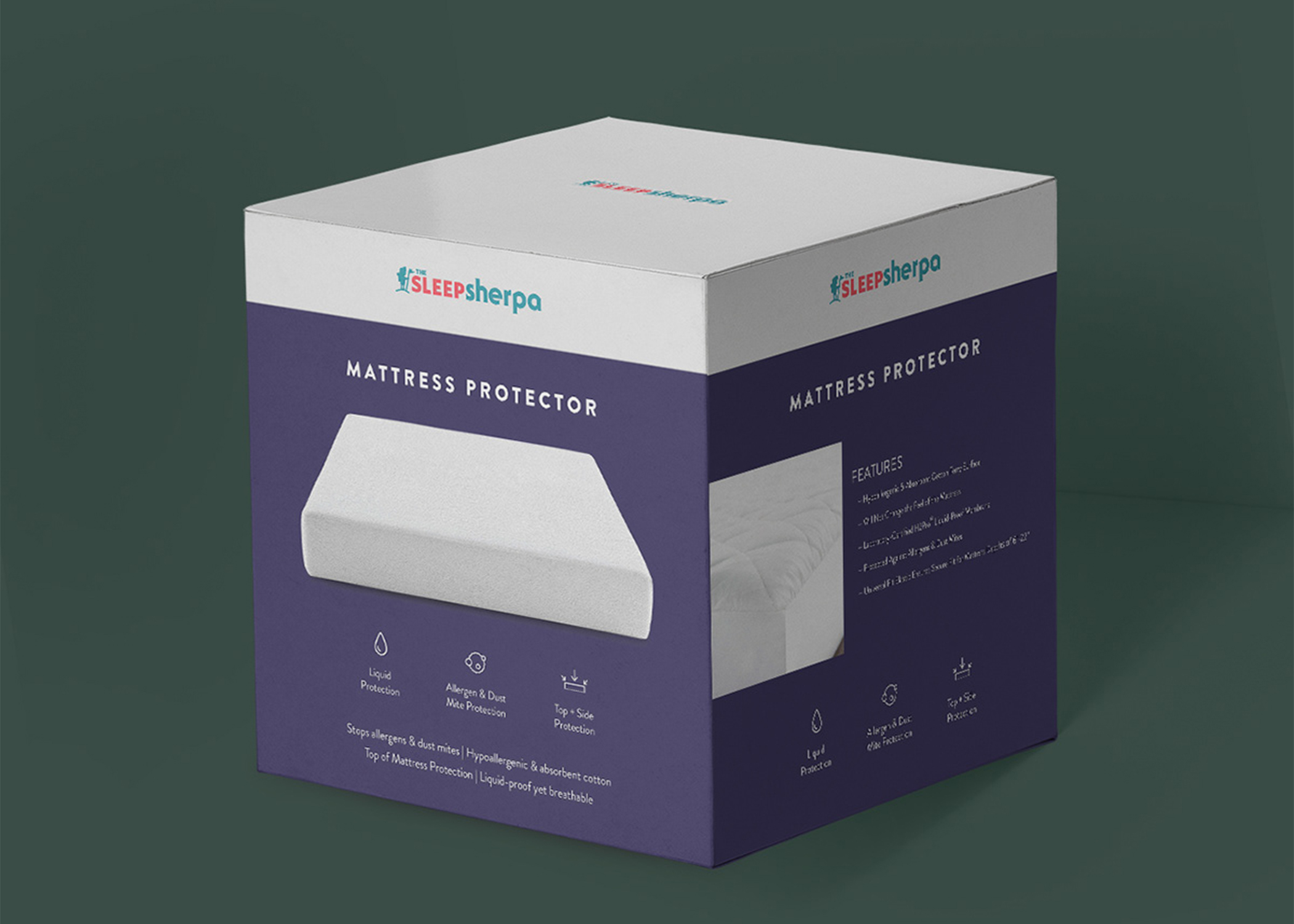
Sleep Sherpa Mattress Protector
The SleepSherpa mattress protector packaging was designed to solve a fundamental visibility problem: how to make a low-consideration product feel premium, trustworthy, and easy to understand at a glance. In a category often dominated by overly technical claims and uninspired visuals, the approach centered on clarity and restraint. A structured box format was chosen to immediately elevate perceived value and improve stackability for retail, while a clean, grid-based layout organizes product information into digestible sections. The hero product render removes ambiguity around what’s inside, and a simplified icon system communicates key benefits—water resistance, breathability, and protection—without relying on dense copy that typically overwhelms shoppers.
Another key challenge was creating a system that could scale across variants while maintaining consistency. This was solved through a modular color-blocking approach, allowing each SKU to differentiate through bold yet controlled color fields without disrupting the core layout. The hierarchy was carefully refined to ensure the most important information surfaces first, addressing the common issue of customers struggling to compare similar products on shelf. Subtle brand accents and ample negative space reinforce a sense of calm and cleanliness—qualities directly tied to the product’s purpose. The final result is a packaging system that transforms a functional necessity into a considered, design-forward product, helping SleepSherpa compete more effectively in both retail and e-commerce environments.
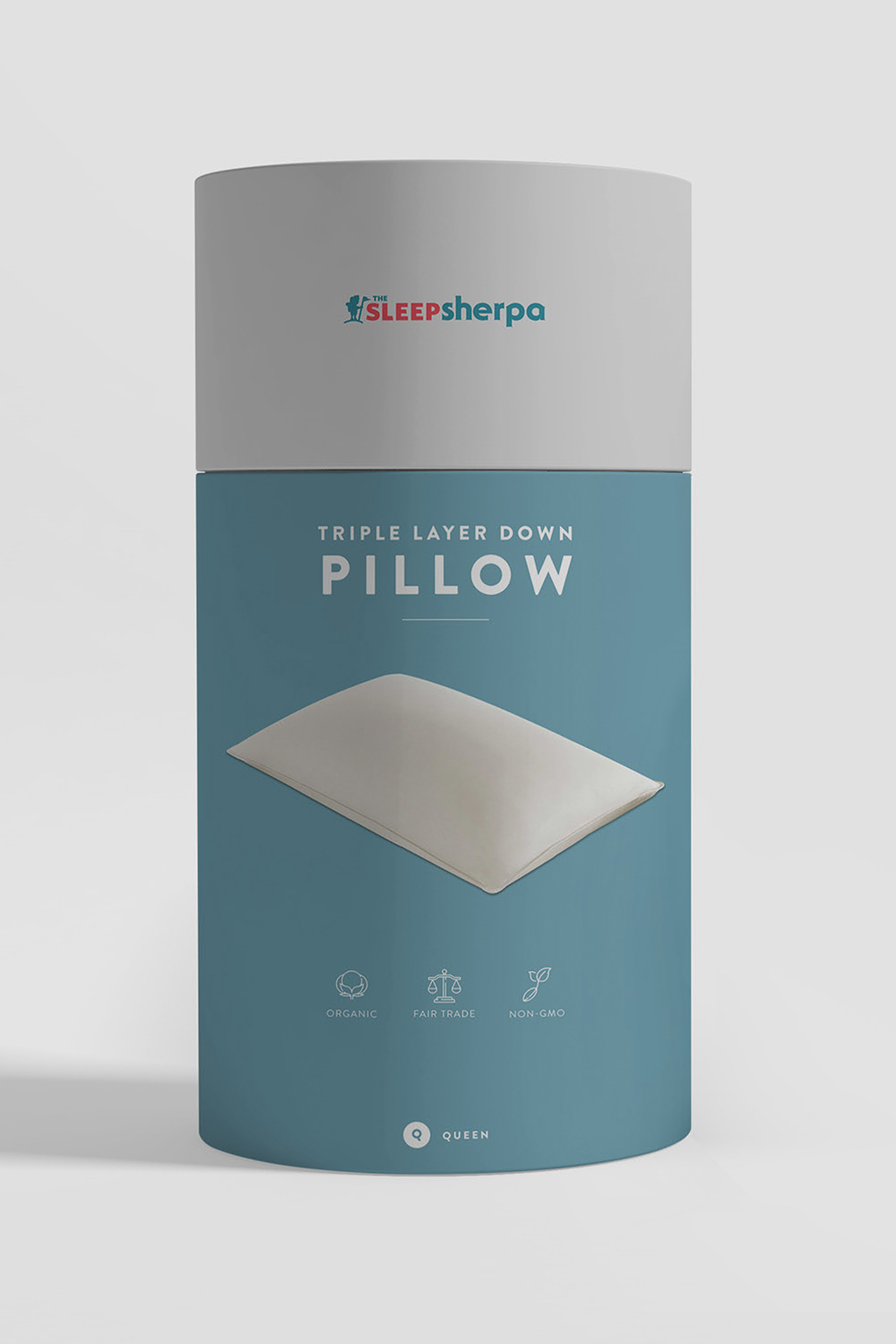
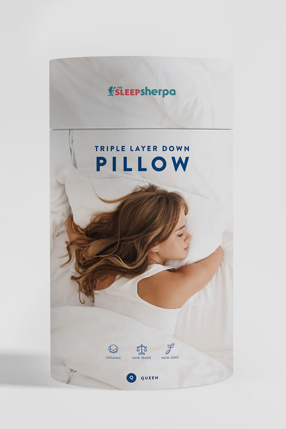
Sleep Sherpa Pillow
The packaging for SleepSherpa’s Triple Layer Down Pillow was developed to solve a core challenge: how to communicate comfort, quality, and technical construction in a category often dominated by cluttered claims and indistinct branding. The design approach focused on stripping back visual noise and prioritizing a calm, breathable aesthetic that mirrors the product’s purpose—better sleep. A clean cylindrical format creates strong shelf presence while remaining easy to handle and ship, and a restrained color system differentiates product variations without fragmenting the brand. Clear typographic hierarchy ensures that key information—product name, construction, and benefits—is immediately legible, addressing the common issue of overcomplicated bedding packaging.
To further bridge the gap between emotional appeal and product education, the system introduces flexible front-of-pack storytelling. One variant leverages lifestyle imagery to create an aspirational, relatable moment, while others focus on the product itself for a more premium, minimal presentation. This dual approach solves for different retail and digital contexts without requiring a full redesign. Supporting icons (organic, fair trade, non-GMO) are integrated in a subtle, consistent manner to reinforce trust without overwhelming the layout. The result is a scalable packaging system that balances softness with structure—helping SleepSherpa stand out as both a thoughtful brand and a credible sleep solution in a highly competitive market.


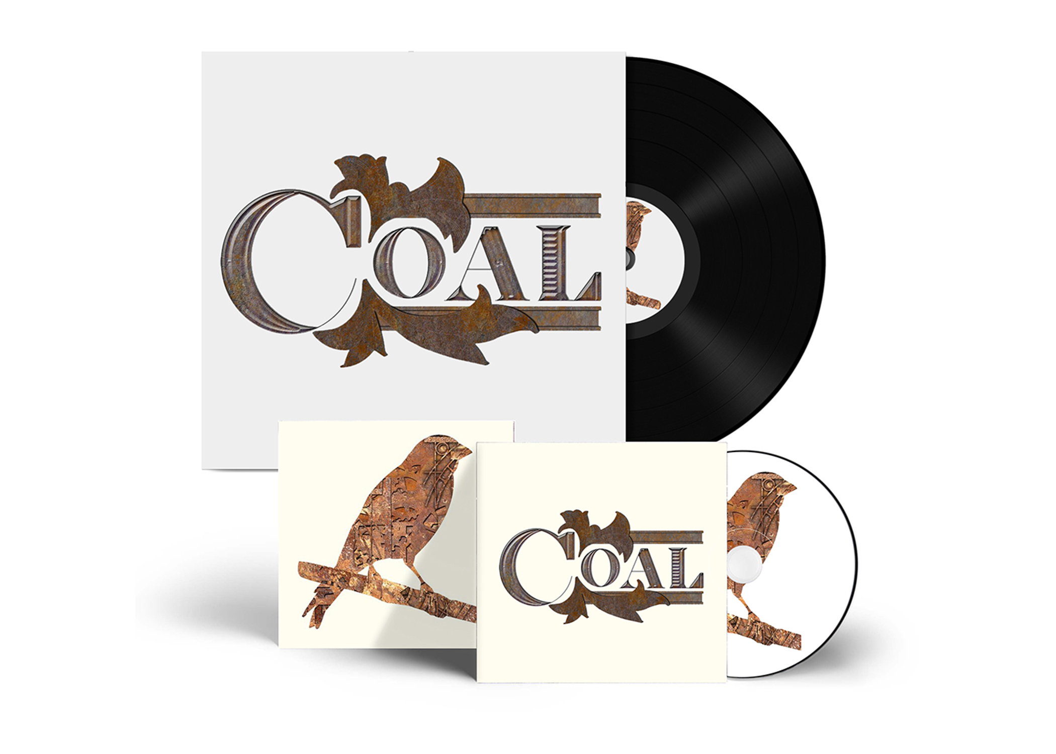
Coal–The Band
The Coal album packaging was rooted in a clear conceptual challenge: how to authentically connect the band’s sound to its origin without falling into cliché or overused “industrial” visuals. Drawing from Ironbridge, Shropshire—the birthplace of the Industrial Revolution—the design translates history into materiality rather than imagery. Instead of literal smokestacks or machinery, the solution focused on texture and craft: oxidized metal surfaces, engraved detailing, and weighty, forged typography that feels constructed rather than designed. This approach solved the problem of authenticity, allowing the visuals to echo the grit and permanence of ironwork while remaining refined and contemporary. The custom wordmark integrates directly into the texture, eliminating the separation between type and background and reinforcing the idea that the music and its origins are inseparable.
A second challenge was creating a cohesive system that could extend across vinyl, CD, and supporting materials without losing impact or becoming visually repetitive. This was addressed through a restrained but flexible visual language—anchored by the industrial texture and balanced with moments of negative space to maintain clarity and legibility. The bird motif introduces contrast and narrative, symbolizing tension between industry and nature, weight and release, giving the system emotional range beyond its harder textures. By carefully controlling scale, composition, and material consistency, the design adapts seamlessly across formats while maintaining a singular identity. The final result is a packaging system that feels both historic and immediate—an artifact shaped by place, process, and sound.
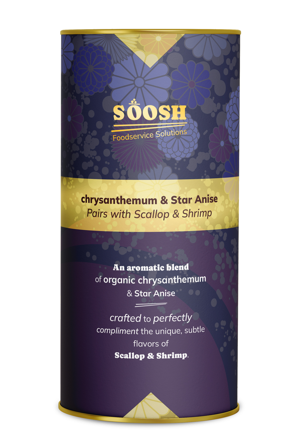
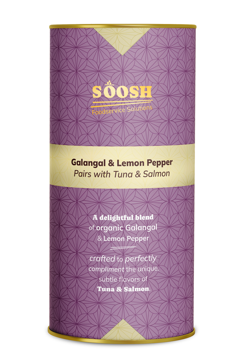
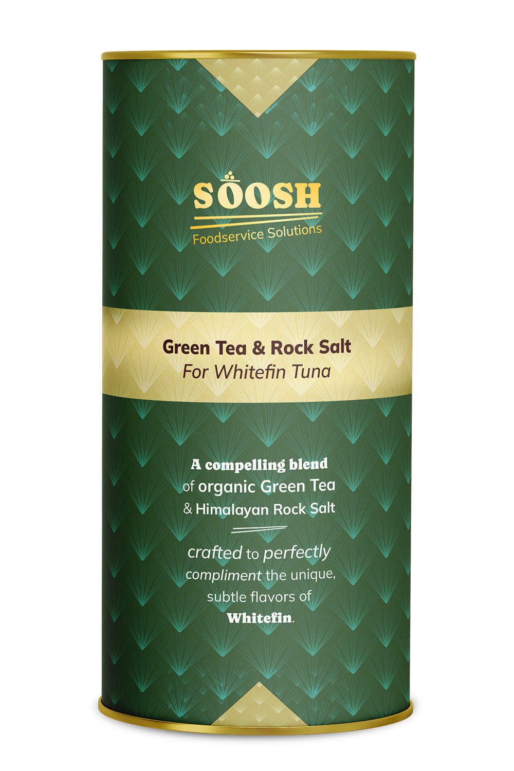
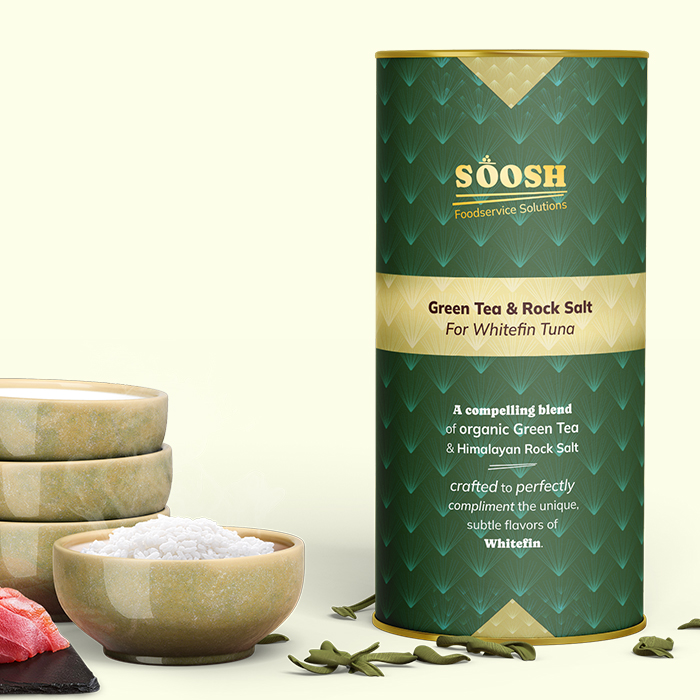
Soosh
The Soosh packaging system was designed to elevate a functional seasoning product into a refined, gift-worthy experience that resonates with both professional chefs and at-home cooks. Drawing inspiration from traditional Japanese patterns and modern culinary presentation, each SKU features a distinct color palette and geometric motif that communicates flavor profiles while maintaining a cohesive brand identity. The cylindrical format reinforces a premium, pantry-forward presence, while metallic gold accents and structured banding introduce a sense of craft and precision—mirroring the discipline of sushi-making itself. Clear typographic hierarchy ensures quick readability in fast-paced kitchen environments, with pairing suggestions prominently integrated to guide users intuitively.
Beyond aesthetics, the design system was built for scalability across a growing product line, allowing new flavors to be introduced without compromising shelf impact or brand recognition. Each variant balances storytelling and utility, combining ingredient highlights with concise descriptive copy that emphasizes quality and versatility. The result is a packaging experience that bridges authenticity and accessibility—positioning Soosh as both a trusted culinary tool and an elevated lifestyle product. By aligning visual language with the rituals of sushi preparation, the brand invites users to engage more deeply with the process, transforming everyday rice into something thoughtful, expressive, and memorable.
A collection of work spanning UX, branding, and digital design across luxury eCommerce, wellness, foodservice, and national consumer brands. Every project starts with a question: what does this brand need to say, and what's the clearest, most compelling way to say it? The answer is never the same twice, but the approach always is: understand the audience, respect the user, and make every design decision earn its place.
TAAKT Watches
Branding | Print

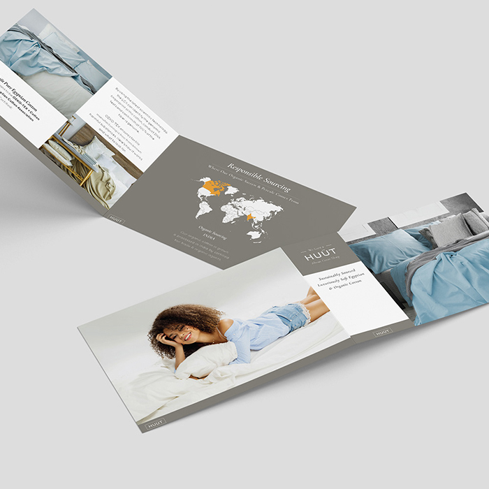
Shuteye Home
Branding | Web/UX/UI
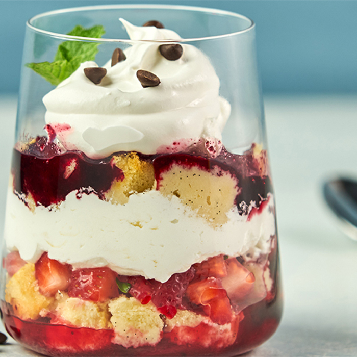
Menuology
Web/UX/UI
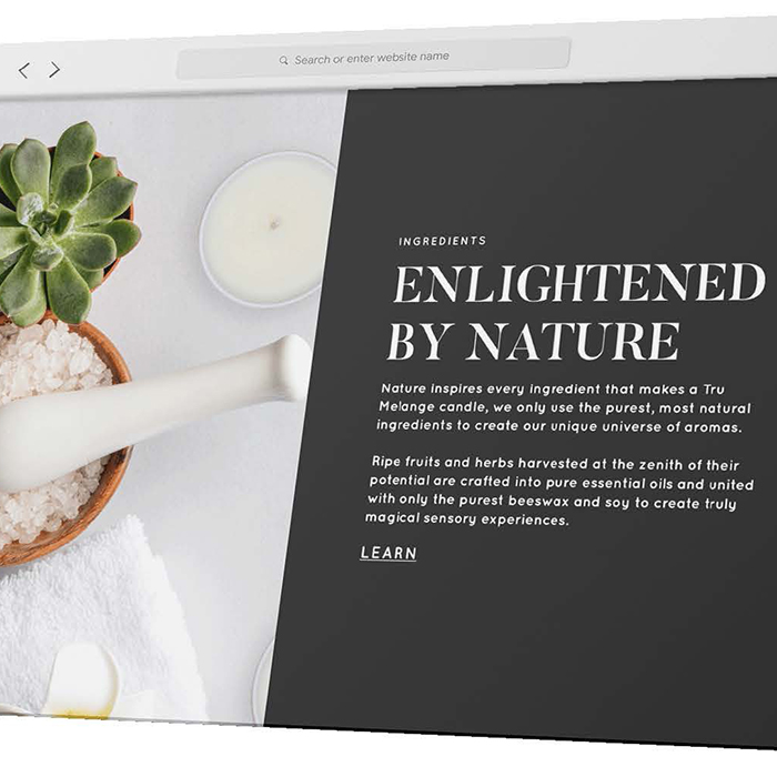
Tru Melange
Web/UX/UI
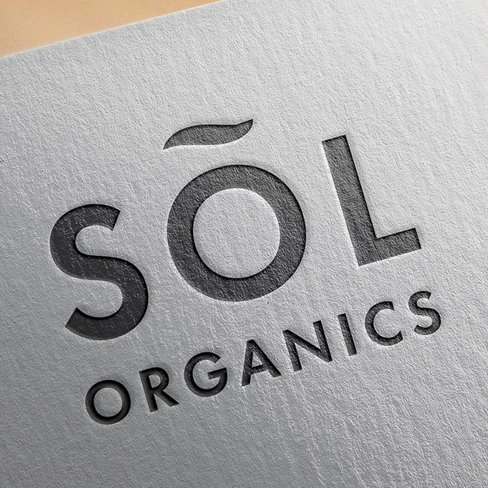
SÕL Organics
Branding | Print | Digital
Print Design
Branding | Print
Packaging Design
Packaging | Print
.jpg)
PepsiCo
Digital
Soosh
Web/UX/UI

Louellen Essex
Web/UX/UI
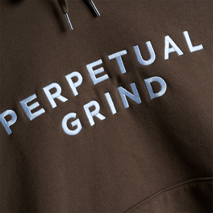
Perpetual Grind
Print | Apparel
Logo
Branding | Logo