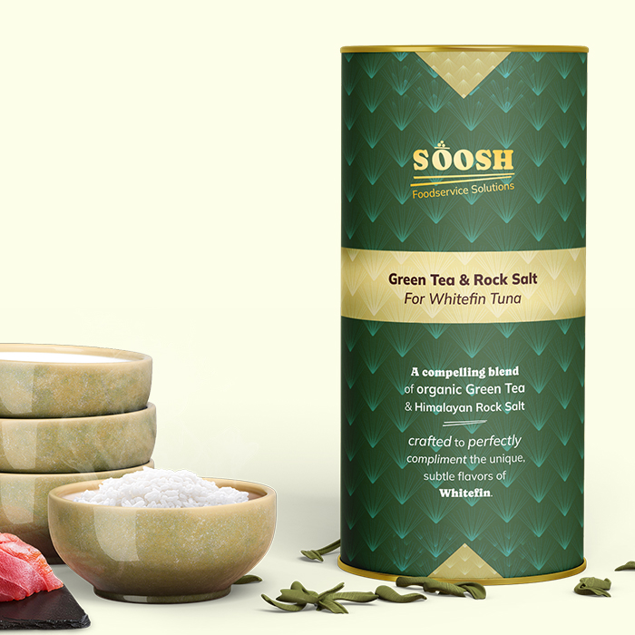
SÕOSH
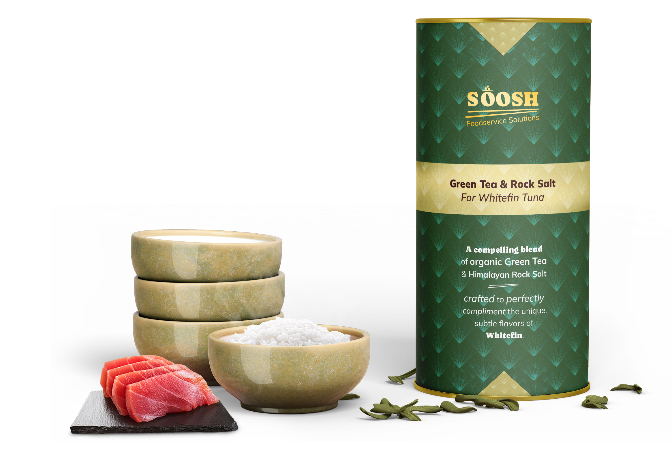
The design needed to do significant educational work without feeling heavy-handed. Most visitors arriving at the site would have little context for what sushi seasoning blends are or why they'd need them, so every section of the homepage was structured to build understanding and desire simultaneously. The hero leads with a benefit-first headline — "Sushi seasoning blends that transform the ordinary into the extraordinary" — paired with rich product photography that immediately establishes a premium, artisan aesthetic through warm, earthy tones and clean typography.
Trust-building was central to the UX strategy. A statistics bar communicates the brand's credentials at a glance — 10+ years of expertise, 100+ restaurant partners, and 100% organic ingredients — giving both home cooks and professional buyers the confidence to purchase. This is reinforced by a dedicated "Professional-Grade Ingredients and Crafting" section featuring chef imagery and a direct quote, lending authority and craftsmanship to the product story. Testimonials further ground the experience in real results, with reviews that speak specifically to the product's ability to replicate restaurant flavor at home.
The product page itself is clean and conversion-focused, presenting flavor variants with clear pricing and a straightforward add-to-cart flow. The overall palette — warm cream backgrounds, forest green accents, and muted gold typography — is cohesive and premium without feeling inaccessible, striking the balance between specialty food brand and everyday kitchen staple. The result is a site that positions Sōosh not just as a product, but as a gateway to a higher standard of home cooking.
Sonnet 4.6
SÕOSH
Sōosh is a specialty food eCommerce brand built around a simple but compelling premise: that restaurant-quality sushi is achievable at home, with the right seasonings. The brand offers a line of premium sushi seasoning blends made from 100% organic ingredients, developed over 10+ years and informed by restaurant-grade formulations. The challenge was creating a website that could communicate that elevated promise clearly and confidently — turning a niche, unfamiliar product category into something aspirational and accessible for home cooks and professional chefs alike.

A collection of work spanning UX, branding, and digital design across luxury eCommerce, wellness, foodservice, and national consumer brands. Every project starts with a question: what does this brand need to say, and what's the clearest, most compelling way to say it? The answer is never the same twice, but the approach always is: understand the audience, respect the user, and make every design decision earn its place.
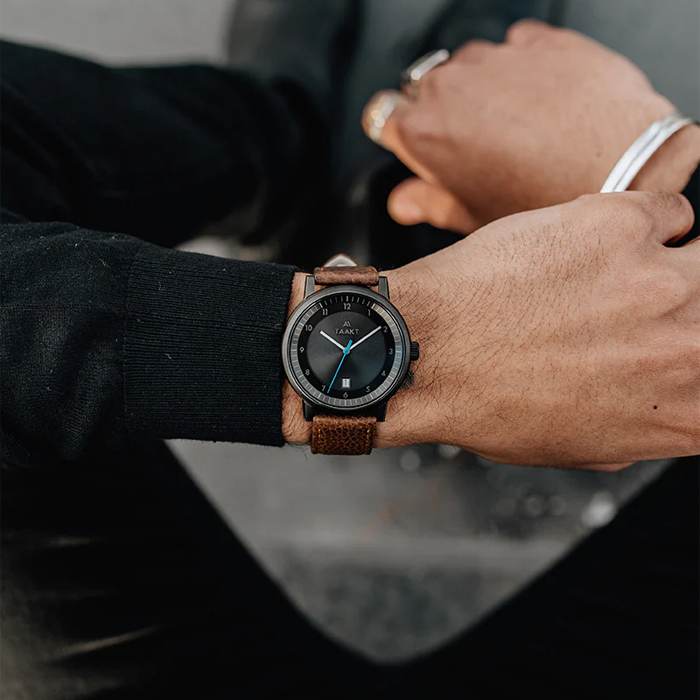
TAAKT Watches
Branding | Print

Shuteye Home
Branding | Web/UX/UI
Menuology
Web/UX/UI
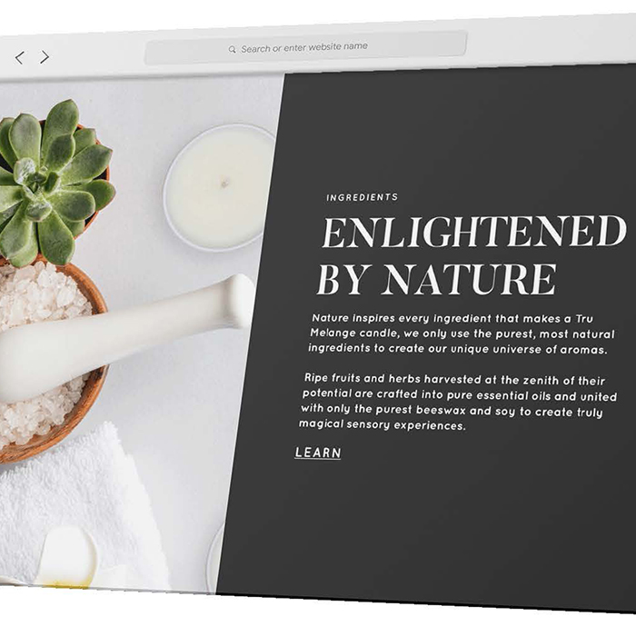
Tru Melange
Web/UX/UI
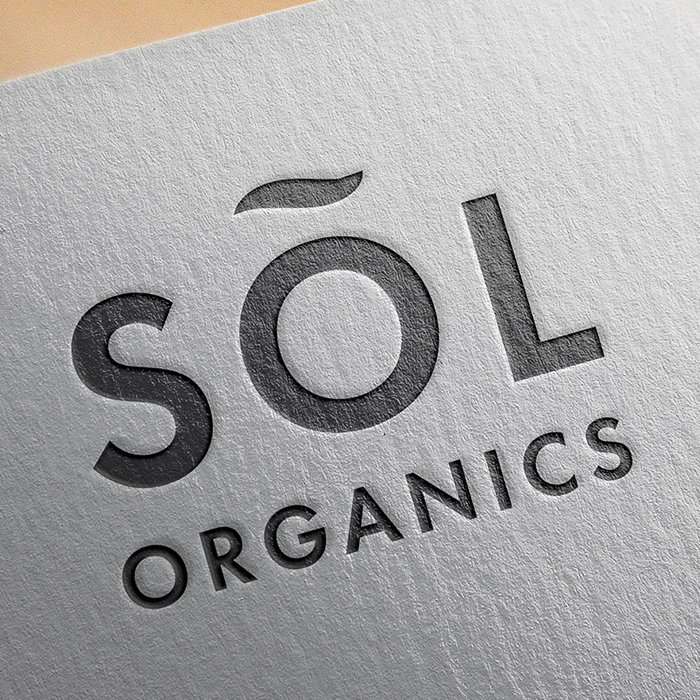
SÕL Organics
Branding | Print | Digital
Print Design
Branding | Print
Packaging Design
Packaging | Print
.jpg)
PepsiCo
Digital
Soosh
Web/UX/UI
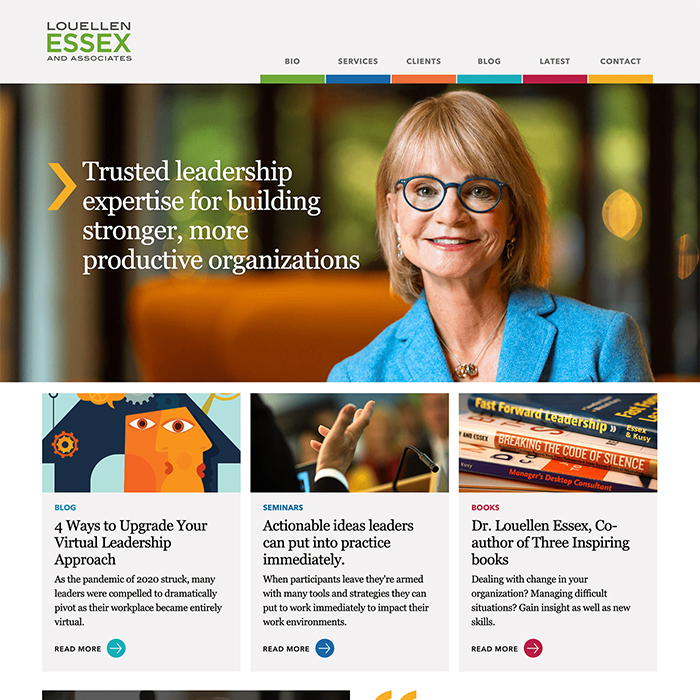
Louellen Essex
Web/UX/UI
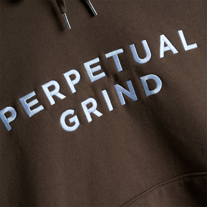
Perpetual Grind
Print | Apparel
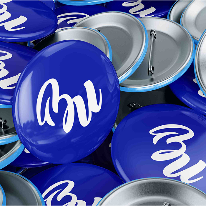
Logo
Branding | Logo