Menuology
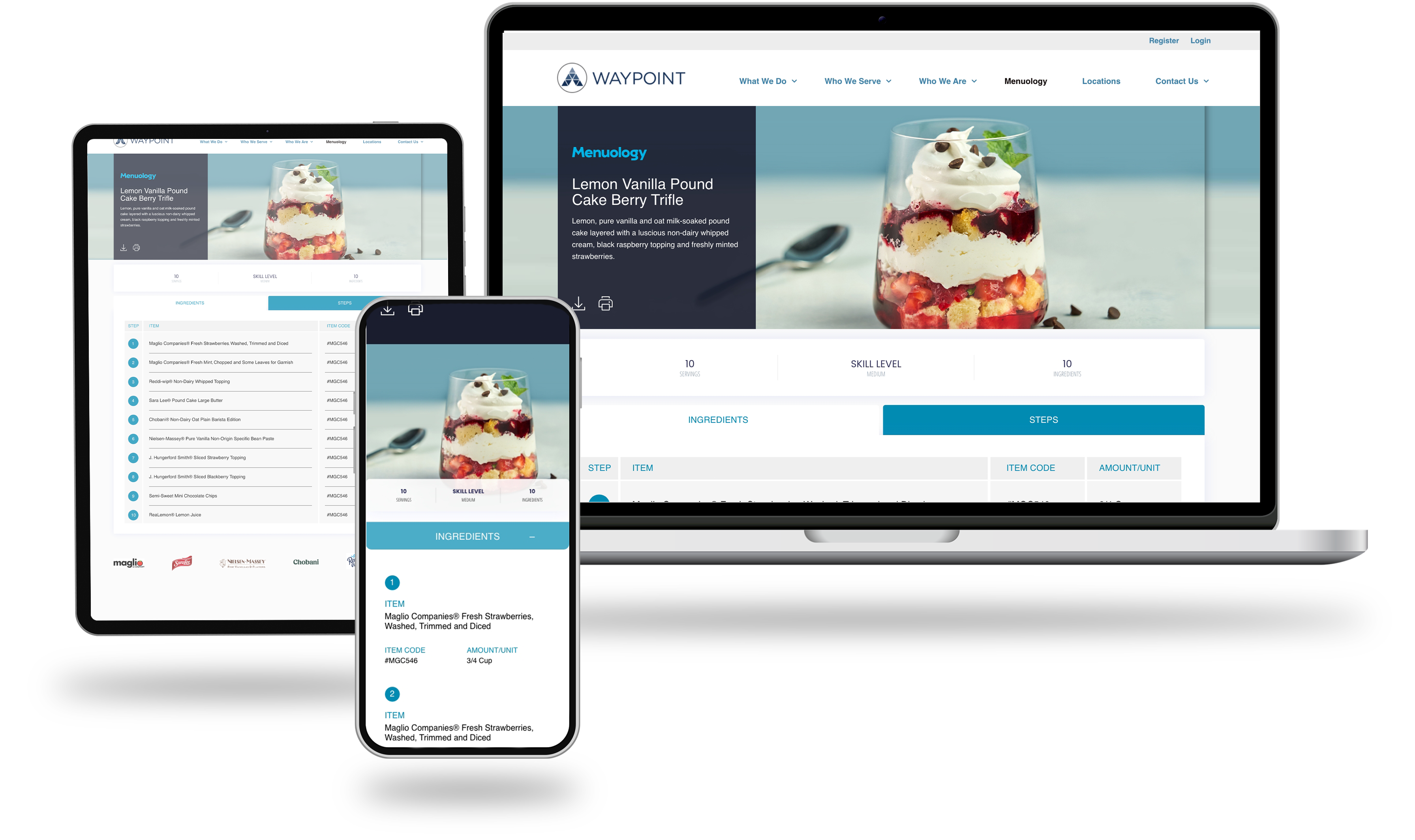
Menuology is a recipe discovery and inspiration platform built within the Waypoint website, designed for foodservice professionals and culinary buyers. The goal was to create a destination where chefs and operators could explore on-trend recipes, filter by their specific needs, and find practical, brand-supported menu ideas — all within a clean, professional interface that reflected Waypoint's positioning in the foodservice industry.
The platform needed to serve a dual purpose: inspire creativity while also functioning as a practical procurement tool. Each recipe links directly to the branded ingredients used, connecting culinary inspiration to the supplier relationships at the core of Waypoint's business. This meant the design had to balance a rich, food-forward aesthetic with structured, data-driven functionality.
Menuology
The recipe landing page leads with a bold hero and the tagline "Explore. Inspire. Customize." — setting the tone for a browsing experience built around discovery. A robust filtering system allows users to narrow results by brand, product, daypart, cuisine, segment, category, allergen, and difficulty, making it easy for professionals with specific operational constraints to surface relevant content quickly. Filters are persistently visible on desktop and collapse cleanly into an accessible panel on mobile.
.jpeg)

Menuology
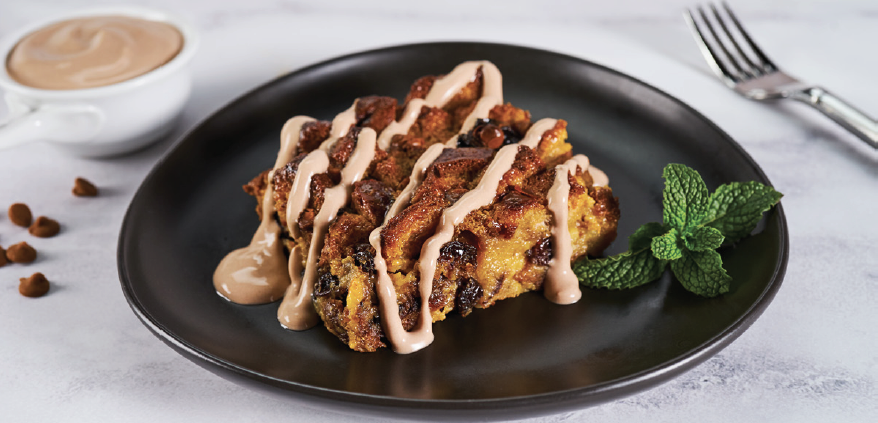
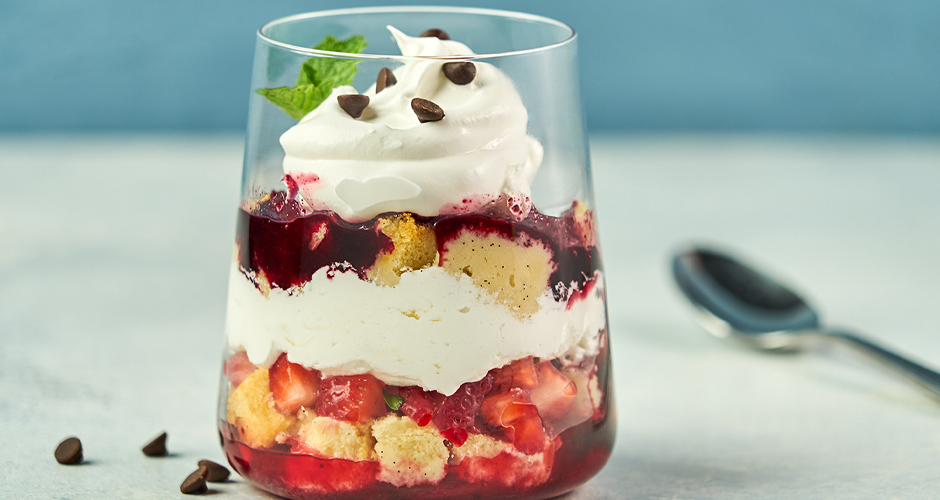
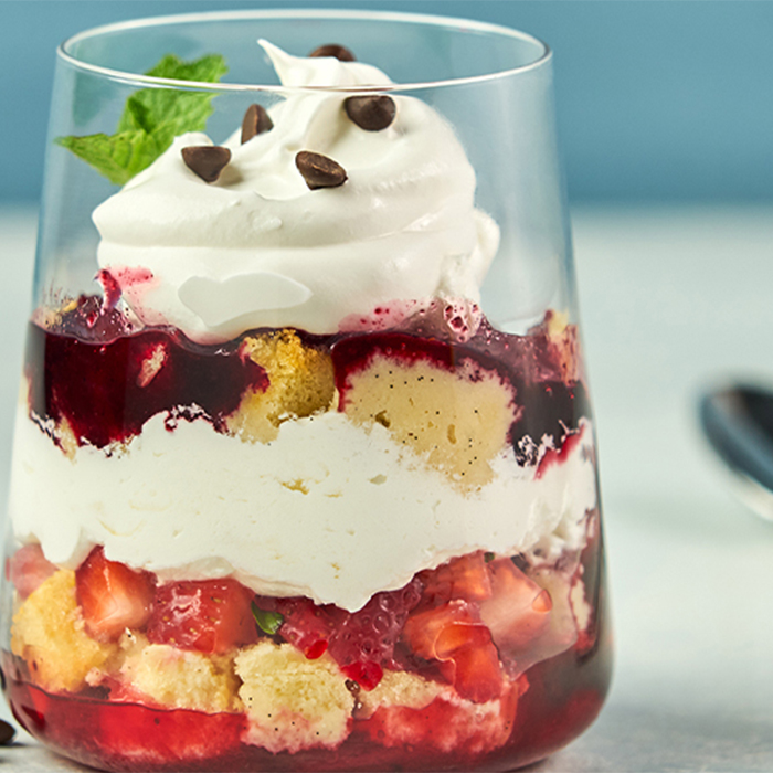
Individual recipe pages were designed to communicate everything a professional needs at a glance — servings, prep time, difficulty, ingredient count, and dietary tags — before expanding into three tabbed sections covering Ingredients, Steps, and Nutrition. The ingredients list is particularly notable: each item links to the specific branded product, complete with item codes and units, bridging the gap between culinary inspiration and real-world ordering. Brand logos displayed at the foot of each recipe reinforce the supplier partnerships that underpin the platform.
The design scales thoughtfully across desktop, tablet, and mobile. On smaller screens, the layout reflows into a single-column format with collapsible filter accordions and stacked ingredient tabs, preserving usability without sacrificing the visual quality of the food photography. A "More Recipes You Might Like" module at the bottom of each page encourages continued exploration, supporting both engagement and cross-discovery of Waypoint's brand partners.
A collection of work spanning UX, branding, and digital design across luxury eCommerce, wellness, foodservice, and national consumer brands. Every project starts with a question: what does this brand need to say, and what's the clearest, most compelling way to say it? The answer is never the same twice, but the approach always is: understand the audience, respect the user, and make every design decision earn its place.
TAAKT Watches
Branding | Print

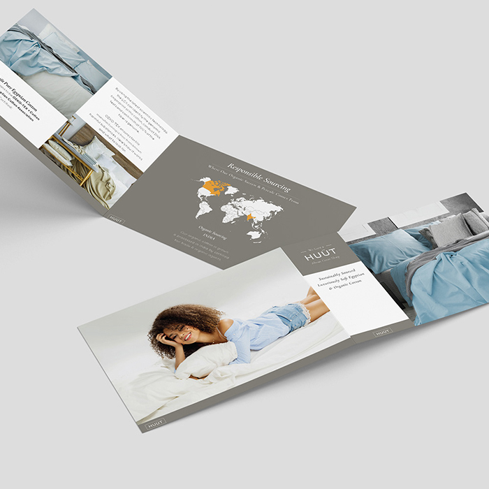
Shuteye Home
Branding | Web/UX/UI
Menuology
Web/UX/UI
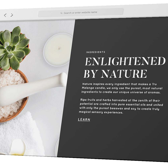
Tru Melange
Web/UX/UI
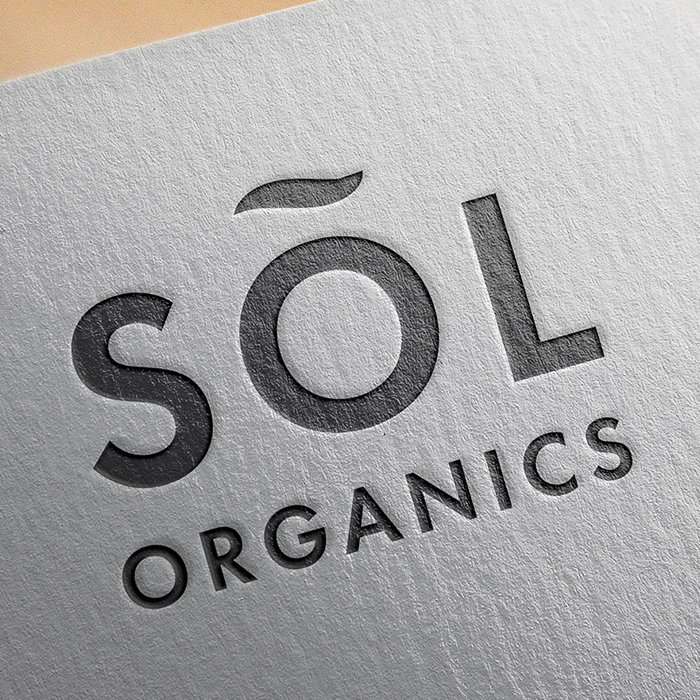
SÕL Organics
Branding | Print | Digital
Print Design
Branding | Print
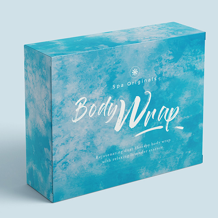
Packaging Design
Packaging | Print
.jpg)
PepsiCo
Digital
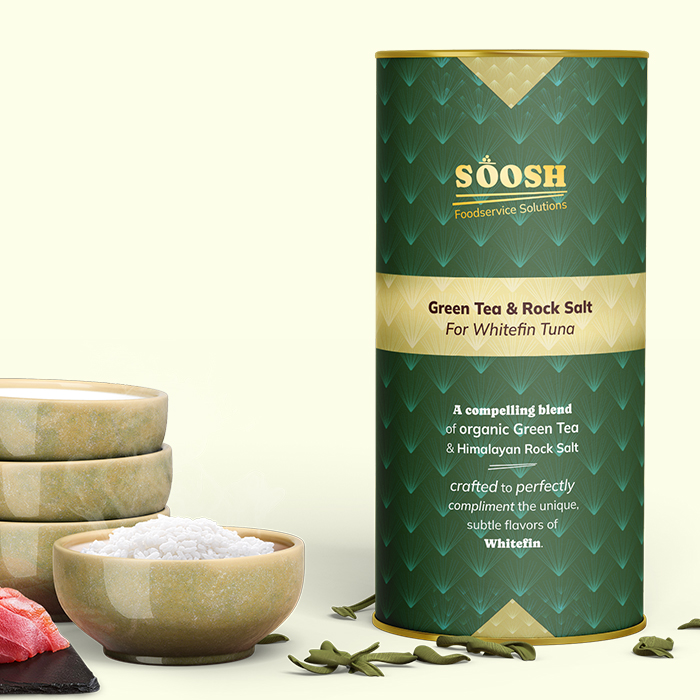
Soosh
Web/UX/UI
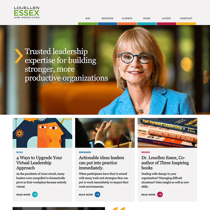
Louellen Essex
Web/UX/UI
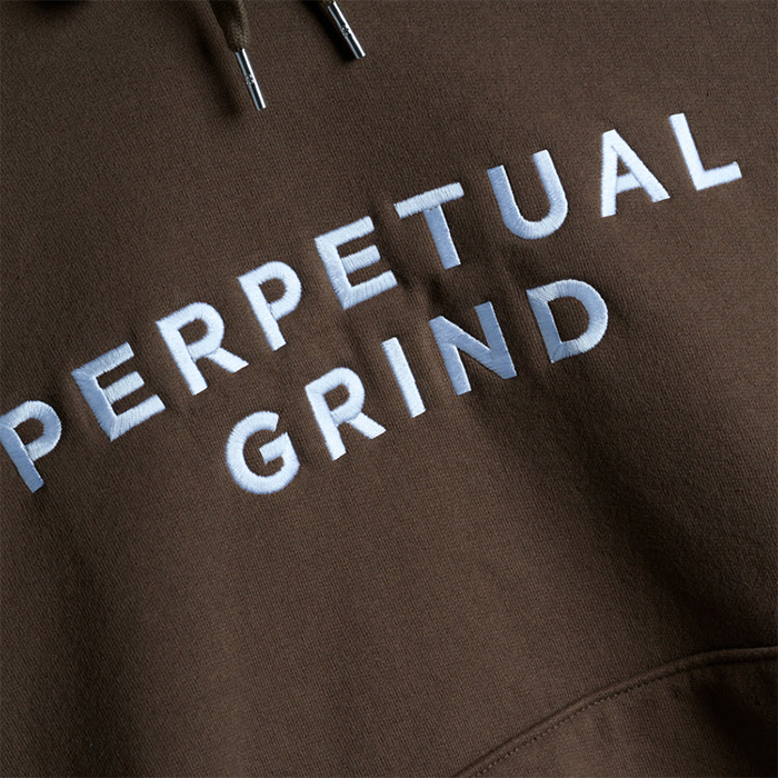
Perpetual Grind
Print | Apparel
Logo
Branding | Logo